Simple website navigation outperforms creative menus because people want to find things quickly. This means if your menu layout feels confusing, most visitors will leave before they even look at your content.
And it happens fast. Users form opinions about your site within just a few seconds. A clean, familiar menu builds trust right away, but a cluttered or unusual layout creates friction and a negative user experience.
That’s exactly why we put this article together. We’ll walk you through the UX design principles behind intuitive navigation, common usability issues worth avoiding, and practical ways to tidy up your site structure. Plus, you’ll see how good navigation supports SEO and keeps people coming back.
Website Navigation Best Practices That Improve User Experience
The best website navigation is simple, familiar, and built around what your visitors need. When you get that right, user experience improves and people stay on your site longer.
So let’s break this into practical stages you can follow.
Design for Users Before Creativity
Most users expect your menu to work like the ones on other websites they already visit. That’s because people rely on recognition rather than recall when they browse. In simple terms, they look for familiar patterns instead of trying to learn something new every time they land on a page.
So when you use unusual or “clever” menu labels, you’re actually adding to your visitors’ cognitive load. For example, calling your services page “What We Brew” might sound fun for a coffee brand, but most visitors won’t know what it means at a glance.
Instead, stick with clear, descriptive words your audience already understands. We understand that it might feel less creative, but it keeps people moving through your site.
Build Navigation Around User Needs
Before you start designing any menu, spend some time on user research first. Run user interviews, send out short surveys, or set up focus groups with your target audience. Then check tools like Google Analytics to see how people move through your site and where they drop off.
The idea is to build navigation around what visitors are looking for, rather than how your business is structured internally. For instance, your team might think of services by department, but your customers think in terms of problems they need solved. That one shift alone can improve usability across the board.
Create a Clear Information Architecture
Good information architecture means grouping related pages in a way that feels logical to your visitors. Say, if you’re a web designer, your portfolio, case studies, and testimonials could all fall under a single parent menu item (instead of being scattered across three separate links).
Remember to put your most important links where users expect to find them, and order everything by priority. At the same time, try not to overload your menu. Generally, limit your main navigation to around five to seven links to help users scan and decide faster without feeling overwhelmed.
Design a Main Menu That Works Everywhere
Your main menu should look and feel consistent on every page of your site. For that, use descriptive labels, so visitors know exactly where each link leads. And only include the links that are truly important to keep things tidy.
Since so much traffic now comes from mobile devices, your navigation needs to work just as well on smaller screens. A hamburger menu (which is the three-line icon that opens a navigation menu) is a common solution for mobile sites.
Just make sure it’s easy to tap and doesn’t hide important links too deeply. If your mobile site feels difficult to use, visitors will quickly leave for a competitor with a smoother experience.
Validate Your Decisions with Usability Tests
You might feel confident your navigation works well, but the only way to know is by testing it with real users.
So set up usability tests where participants try to complete common tasks on your site. This can be finding a service, locating your contact page, or checking your pricing. Then review heatmaps and watch session recordings using Hotjar to see exactly where people get stuck or give up.
From there, lean on your analytics to spot patterns in user behaviour over time. Even small tweaks, like renaming a menu label or reordering your links, can lead to noticeable improvements when they’re backed by real user feedback.
The UX Design Process Behind Navigation That Converts
Now you know good navigation comes from a structured UX design process. This includes research, testing, and regular improvements based on how users behave on your site.
Here’s a look at how that process works.
The Main Stages of the UX Design Process
Every well-designed menu runs through a series of stages before it ever goes live. When you skip any of them, you end up guessing (and guessing rarely leads to good results).
This is what each stage looks like in practice:
- Market Research: Start by studying how competitors lay out their menus. This gives you a feel for what users in your industry already expect when they land on a site.
- User Research: With that baseline in place, it’s time to hear directly from your target audience. User interviews, surveys, and focus groups all help you understand what visitors need from your site.
- Information Architecture: Group your website content into logical categories. The goal is to make sure visitors find related pages without clicking around aimlessly.
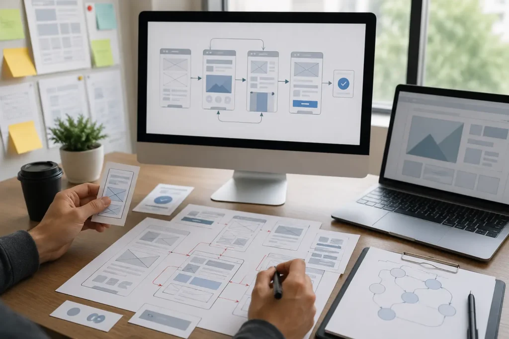
- Wireframing: At this point, sketch out basic page layouts. These rough drafts show where your main menu, links, and other elements will sit on screen before any real design work begins.
- Prototyping: Those wireframes then become a clickable version of your site. A working prototype lets you see how users realistically interact with your navigation.
- User Testing: Put your prototype in front of your users and watch where they click, pause, or get completely lost. Their behaviour will tell you more than any internal opinion ever will.
- Iteration: Finally, take everything you’ve learned and refine your navigation. Small changes based on usability tests can make a surprising difference to how smoothly people move through your site.
Each stage feeds naturally into the next one. So if you skip the research and jump straight to design, you’ll probably end up rebuilding things later anyway.
Why Creative Menus Often Fail
A menu might look stunning and still frustrate the people trying to use it. The reason is as we covered earlier: most users carry strong mental models about how navigation should work.
So when a menu breaks those expectations, visitors have to stop and figure things out. That extra effort adds cognitive load, which creates friction and slowly eats away at trust.
Through our experience working with Brisbane businesses, we’ve found that the simplest menus almost always outperform the flashiest ones. After all, if someone can’t find your services page within a few seconds, the design isn’t doing its job, regardless of how polished it looks.
When Creative Navigation Makes Sense
That said, there are a few cases where a non-traditional menu can actually work well. Portfolio websites, creative agencies, and interactive campaigns sometimes benefit from a more experimental layout because their audience expects something different.
Digital storytelling projects are another good fit. If the whole point of the site is to guide users through a visual experience, then a unique menu can support that goal nicely.
But for most business websites, these are exceptions rather than the rule. In particular, businesses that want to drive more conversions should stick with a familiar navigation layout that helps visitors move easily through the site.
Design Website Navigation That Feels Easy to Use
People will remember how easy your site was to use, not how fancy your menu looked. That’s because the best website navigation works in the background and guides visitors to what they need without making them think too hard.
And here’s what we’ve found over the years. Even small usability improvements can lead to measurable results for your business. So it’s worth taking some time to look at your own navigation with fresh eyes.
From there, watch how users complete common tasks on your site. Then use usability tests along with honest user feedback to find out exactly where the friction is hiding.
If you’d like a hand with any of this, the web design team at Graphedge is here to help. We build navigation that works for both your visitors and your business goals.