
Mobile form accessibility often suffers for a few common reasons. Their input fields might not have proper labels, or their error messages might leave users guessing what went wrong. Small touch targets can cause problems, too, especially for people who struggle with precise movements.
We’ll break down these and other common reasons mobile contact forms fail accessibility tests. More importantly, you’ll see how to fix each problem so people can fill out your form without getting stuck. Let’s start with the first reason.
Form Labels and Input Design Problems
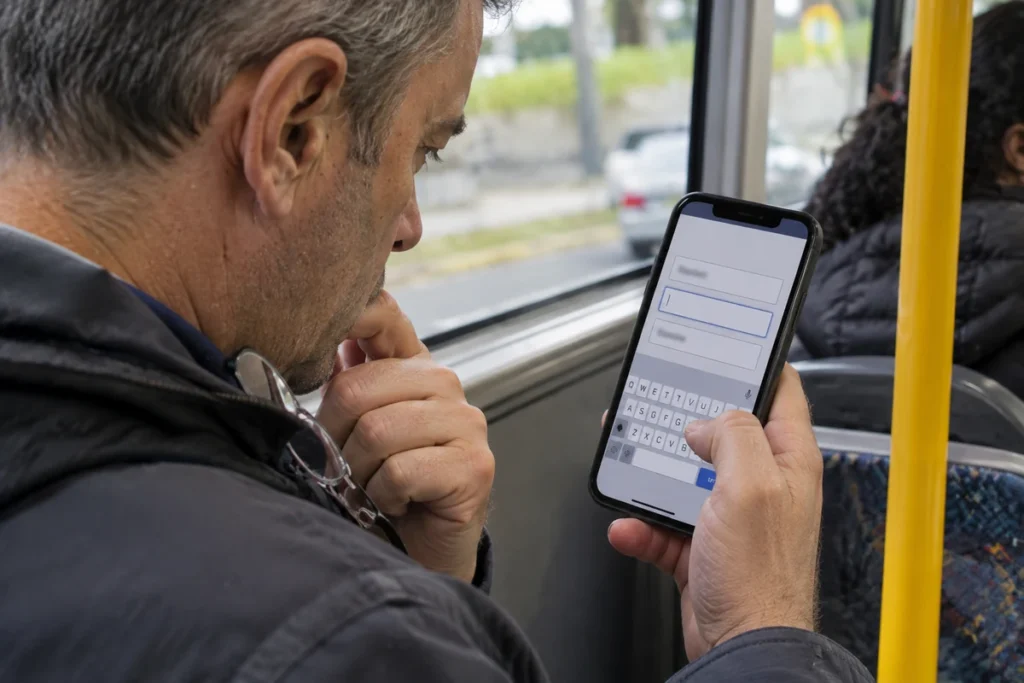
A contact form should make it obvious what information goes in each field. But some mobile forms rely on placeholder hints, use the wrong input types or ask for more details than they need. We’ll look at why these three common design mistakes cause problems and what you can do about them.
Missing Labels and Placeholder-Only Fields
Have you ever started filling out a form, only to forget what a field was asking for once its hint disappeared? That’s what happens when developers use placeholder text instead of proper labels.
A placeholder sits inside an input field and usually disappears as soon as someone starts typing. This can confuse people with memory or cognitive difficulties, especially when they’re filling out a longer form. Screen readers may also fail to identify the field correctly if it has no accessible name.
How to fix it: Give every input a visible label and connect it to the field using the HTML label element. For example, place “Email address” above the email field rather than using it as a placeholder. You can still include a placeholder for extra guidance, such as an example email address.
Incorrect Input Types and Mobile Keyboards
Imagine tapping a phone number field and getting a full keyboard of letters and symbols. You have to switch layouts just to enter a few digits. Having to do this repeatedly adds extra taps and increases the chance of typing mistakes.
This usually happens when developers use the wrong HTML input type. Mobile browsers use this information to decide which keyboard to display, so the right setting can save users several unnecessary steps.
How to fix it: Use type=”email” for email addresses and type=”tel” for phone numbers. For numeric-only fields such as postcodes, consider inputmode=”numeric” to bring up a number pad.
These settings give visitors a more suitable keyboard for each field, so they can enter information with fewer taps. Just make sure to test the fields on an actual iPhone and Android device to check that the expected keyboards appear.
Too Many Fields and Missing Autocomplete
Every extra field gives visitors more to type on a small screen, which can make them less likely to complete your form. HubSpot found that conversion rates decrease slightly as the number of form fields increases, based on an analysis of more than 40,000 landing pages.
How to fix it: Keep your contact form short and enable autocomplete. Ask only for the information you need to respond to an enquiry. Then use HTML autocomplete attributes, such as autocomplete=”email”, so visitors can fill in saved details without typing them again.
Mobile Form Validation and Error Handling Problems
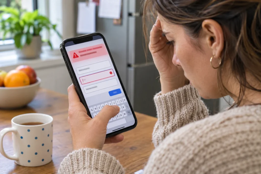
Form validation helps visitors correct mistakes before submitting their details. But poorly handled errors can confuse them, interrupt the form-filling process or make it difficult to find what needs fixing. Watch out for these four common problems.
1. Error Indicators That Rely on Colour Alone
A red border around an input field might look like an obvious warning, but it doesn’t tell everyone what’s wrong. Someone with colour blindness might miss the change, while assistive technology won’t identify the field as having an error.
How to fix it: Add a written error message beside each field that needs attention. For example, instead of highlighting an invalid phone number with a red border, display “Enter a valid 10-digit phone number” below the field. You can keep the red border as an additional visual cue, but never rely on colour alone to communicate an error.
2. Screen Readers Never Hear the Error Announced
When a visitor submits a form, the browser might display an error message beside an invalid field. But unless the form is set up to communicate that change, the visitor might never hear it. They’ll have to navigate through the form to find out what went wrong.
How to fix it: Developers can use an HTML attribute called aria-describedby to associate an error message with its input field. This tells screen readers which message belongs to which field. For instance, you can link an email field to its error message so the message is announced when someone focuses on that field.
3. Validation Errors That Appear While Users Are Typing
Personally, we find premature warnings the most irritating bug on any phone form (nobody enjoys being corrected halfway through a sentence).
Just think about it. You’re typing your email address and see an “Invalid email” warning after entering just the first few characters. The form hasn’t given you a chance to finish, yet it’s already telling you something is wrong.
Now, you’re distracted by a warning you can’t act on yet. Plus, you haven’t even finished entering your email address, so the form is flagging incomplete information as an error.
How to fix it: Wait until visitors leave a field or submit the form before showing validation errors. This will give them time to finish entering their details without unnecessary interruptions. You can still provide format instructions while they type, but save error messages for information that remains invalid after they’ve finished.
4. Error Messages That Don’t Explain How to Correct a Problem
A message like “Something went wrong” tells visitors there’s a problem but leaves them guessing what to do next. On a long mobile form, they might have to scroll through several fields just to find the one that needs attention.
How to fix it: Write error messages that identify the problem and explain how to correct it. Instead of displaying “Invalid input,” tell visitors exactly what to do: “Enter a valid email address, such as name@example.com.” If your form has several errors, add a summary near the top that links to the affected fields. This will help visitors find and correct problems without searching through the entire form.
Mobile Navigation and Touch Accessibility Problems
You might have an accessible contact form, but if visitors can’t navigate it comfortably on a phone, they may struggle to complete it. Two common accessibility issues can get in their way.
Touch Targets That Are Too Small or Close Together
Have you ever tried tapping a small checkbox on your phone and accidentally selected the one beside it? This often happens when form controls sit too close together or don’t leave enough room for your finger.
It can be particularly difficult for people with tremors, limited dexterity or other motor disabilities. They might repeatedly select the wrong option or struggle to press the submit button.
How to fix it: Make buttons, checkboxes and other interactive elements large enough to tap comfortably. WCAG 2.2’s minimum target size requirement is 24 × 24 CSS pixels for many controls, with some exceptions. Aim for 44 × 44 pixels where possible, following its enhanced target size criterion. Leave enough space between neighbouring controls, too. Finally, test the form on a real phone to see whether you can tap each option without accidentally selecting another.
Keyboard Focus That Jumps Out of Order
When someone navigates a form using a keyboard or screen reader, they expect to move through the fields in a logical order. But sometimes the focus jumps from the name field to the message box, then back to the phone number. This makes it difficult to follow the form and know where to enter information next.
How to fix it: Arrange your form fields in the same order in the HTML as they appear on screen. For example, if the name field comes first visually, keyboard users should reach it first, too. Avoid using positive tabindex values to change the navigation order, as they can cause unexpected jumps. To test your form, press Tab repeatedly and check that the focus moves through each field in the expected order.
Mobile Accessibility Testing: How to Test Your Contact Form

Automated accessibility tools such as WAVE and axe DevTools can catch common problems, including missing labels and poor colour contrast. But they can’t tell you whether someone can complete your form using a screen reader or whether its error messages make sense.
So combine automated scans with hands-on testing to catch problems before visitors encounter them. The table below shows which issues each method can identify and how to test them.
| Problem | Automated testing | Manual testing | What to do |
|---|---|---|---|
| Missing labels | Usually flags missing labels | Checks whether labels make sense | Run an accessibility scan |
| Low colour contrast | Measures contrast ratios | Checks visibility in different lighting | Fix contrast failures |
| Error announcements | May miss announcement problems | Tests with VoiceOver or TalkBack | Submit the form with errors |
| Touch target size | Can flag some size violations | Identifies accidental taps | Test on a real phone |
| Error wording | Can’t judge whether instructions are clear | Checks whether messages explain how to fix errors | Ask someone unfamiliar with the form |
Add these checks to your testing routine whenever you update the form. This helps catch accessibility problems before they affect visitors.
Fix Your Forms Before the Next Audit Does
Have you tested your mobile contact form with a screen reader or on an actual phone? Pick one form on your site and give it a try. You might spot an issue you’ve overlooked.
If you need help fixing accessibility problems across your website, talk to GraphEdge. We can help you make your forms easier for everyone to use.