Fonts quietly shape the way people experience your website. A messy font can make things feel clunky and confusing. On the other hand, a clean one creates flow, balance, and clarity to the reader’s mind. That’s why choosing the best fonts for websites is important to create a strong impact on how visitors feel when they land on your page.
Most people don’t stay long on a site that’s hard to read. Fonts affect readability and signal professionalism, tone, and trust. How a headline pops or body text settles into place all ties back to thoughtful design work.
In this guide, we’ll show you how font and typography choices change the entire web design process. Each section will break down what works and why, from comparing serif and sans serif typefaces to testing tools and layout tweaks.
Let’s take it step by step and figure out how to make your pages easier to read and better to use.
Web Design: A Symphony of Structure and Style
Good design balances everything, including colours and fancy effects. Fonts are part of that puzzle. The right font makes content easier to scan and helps highlight what matters.
If your website feels smooth to scroll through and easy to read, there’s a good chance the typography is doing its job quietly in the background. When is it off? You’ll know. It’s like wearing mismatched socks to a job interview (no one wants that vibe).
Here’s how fonts help hold the whole thing together:
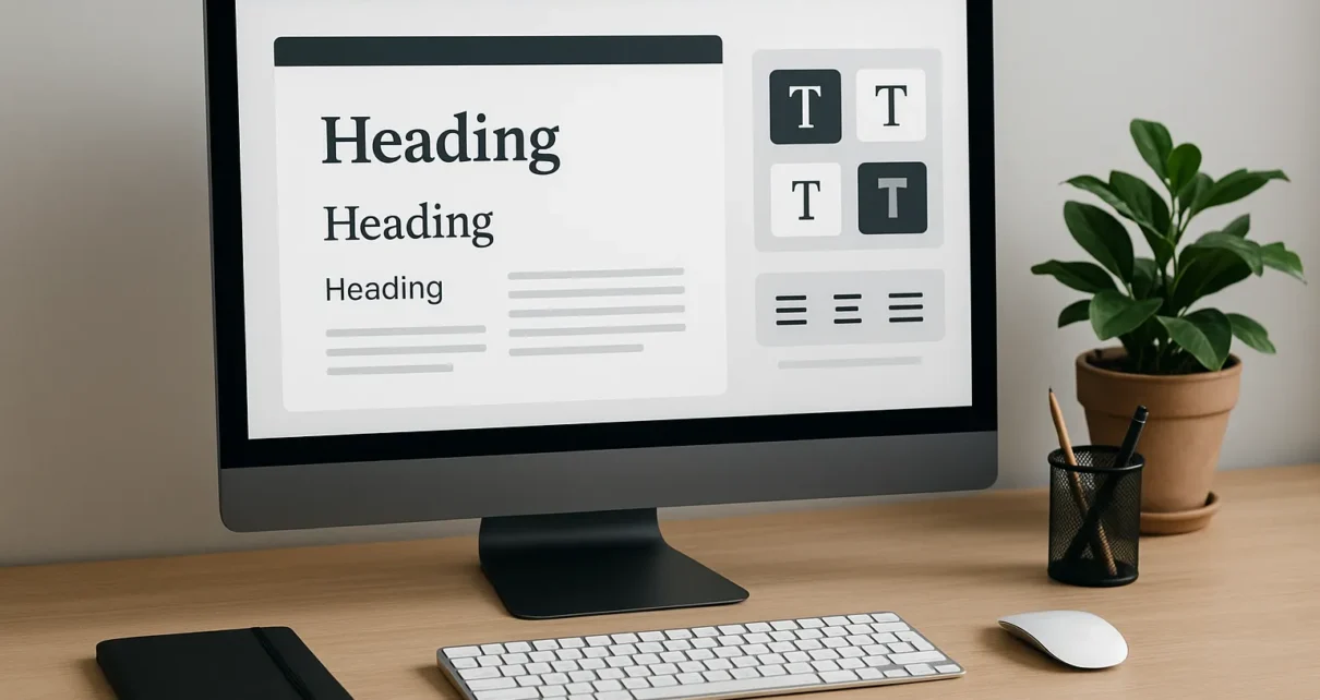
- Headings show visitors where to start. They’re like signs at a train station.
- Subheadings add extra info without shouting.
- Body text should be comfy to read. If it feels cramped or tiny, people won’t stick around.
Tip: Always check your fonts on mobile. What looks amazing on a big screen can turn into an eye test on smaller devices.
Fonts also build flow with other design tools like spacing, alignment, and colour. That’s how designers turn messy ideas into clean, usable web pages. Even the best-designed page can feel awkward or hard to follow without the right typography.
There are some rules that make a font easier to read and use. And now we’ll talk about them.
Font and Typography Principles Every Designer Should Know
Typography is how we shape the space between letters, words, and lines so the message gets across without the user even thinking about it. When it’s done right, people stay focused. When it’s wrong, they leave fast.
Typography can quietly make or break a design. And no, you don’t need a design degree to get the basics right. You just need to know what makes reading easier.
What to get right:
- Font size: Too small, and people squint. Too big, and it feels like the site is yelling at them. Stick to 16px or bigger for body text, especially on mobile.
- Line spacing: Think of this as breathing space. Without enough of it, the words feel jammed together. Aim for 1.4 to 1.6 line height to give readers some comfort.
- Contrast: Black text on a white background is always a safe bet. It’s sharp, simple, and readable. If you’re trying softer colour palettes, double-check contrast using a tool like WebAIM. Don’t rely on how it looks to you/ make sure it’s accessible to everyone.
- Alignment: Left-aligned text is the easiest to follow in English and most Western languages. It creates a clean reading edge and helps the eyes track line to line. Centred text is fine for quotes or titles, but avoid using it for full paragraphs unless you want readers to slow down or skip.
Pro Tip: Use one font for headings and another for body text. Just make sure they complement each other. If they clash, your whole page will feel off.
A study by Virginia Tech found that there’s no huge gap in reading speed between serif and sans serif fonts. The setup matters more. Things like font size, spacing, and layout are where the real impact lies.
Through our practical knowledge, we’ve seen how small changes like adding more space between lines or increasing font size on mobile can drop bounce rates fast.
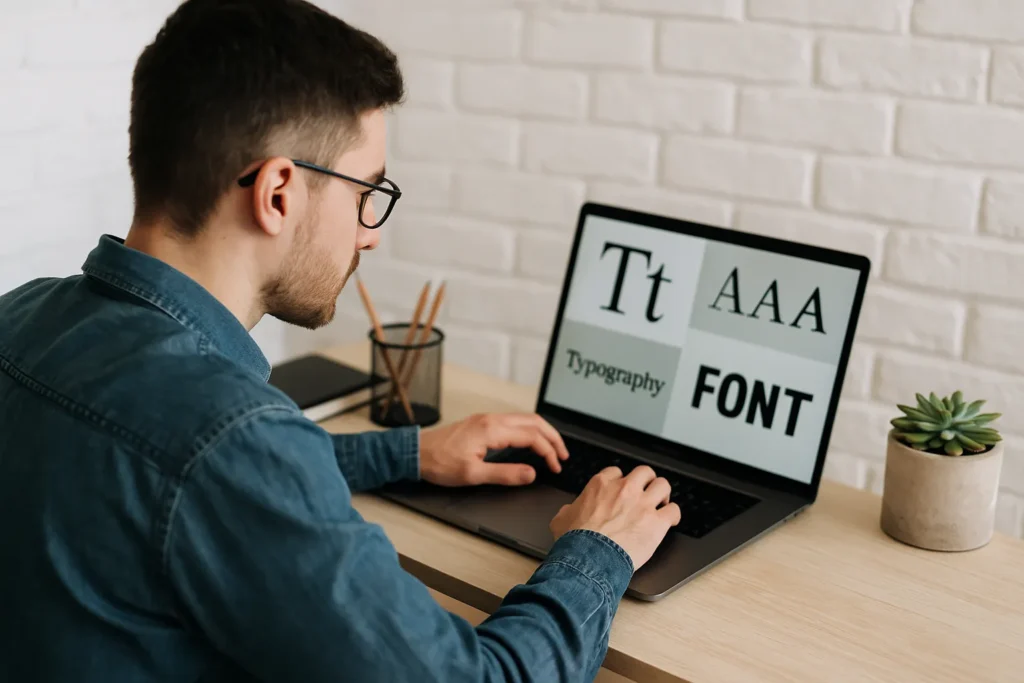
Now that you’ve got the basics, let’s look at the styles like serif and sans serif fonts and when to use each one.
Serif Typefaces and Sans Serif Fonts: When and Why They Work in Web Design
Some fonts look formal. Others feel casual and clean. That’s about looks and the typeface doing its job.
Serif fonts, like Times New Roman or Georgia, have small lines or “feet” at the ends of each letter. They give off a traditional vibe and are often used in print or long-form content. If your brand leans toward classic, serious, or editorial, serif fonts can work well. Think law firms, universities, or literary publications.
Sans serif fonts, like Arial, Helvetica, or Open Sans, don’t have those extra strokes. They feel simpler and more modern. That makes them easier to read on screens, especially on smaller devices. Most tech brands, startups, and blogs go with a sans serif style because it feels cleaner and more adaptable.
We worked with a small consulting firm that used only serif fonts throughout their site. It looked elegant, but felt heavy. After switching to a sans serif typeface for body text while keeping serif in the headings, bounce rates dropped and visitors spent more time on the key service pages.
Style choices don’t stop at serif vs sans serif. Let’s look at how fonts impact how your site is seen at first glance.
Strategic Visual Appeal in Typography

When someone lands on your site, the fonts set the tone often before they read a single word. Clean lines can make your brand feel calm and professional. A quirky typeface might make things feel fun, or a bit chaotic if overdone.
These reactions come from how our brains are wired to recognise patterns and shapes. People associate sharp edges with urgency or authority. Softer curves suggest friendliness and ease. That’s why typefaces trigger emotional reactions.
Fonts influence your graphic design by shaping how the layout feels:
- Angular fonts come across as assertive
- Rounder fonts feel more relaxed
- Tight letter spacing can feel crowded
- Looser spacing gives a more open and easygoing feel
A fashion retailer we worked with used a heavy serif font across their homepage. It looked powerful but also a little cold. After switching to a softer sans serif and loosening the spacing, the site felt more welcoming. Their bounce rate dropped by 12% in just two weeks.
Being visually appealing doesn’t limit itself to adding sparkle. It also helps users feel comfortable enough to stay, read, and not immediately regret clicking.
UX Designers Know that Fonts Influence Behaviour
UX designers think about how people interact with pages, what grabs attention, and how smooth the whole experience feels. Typography sets the mood, controls flow, and quietly shapes decisions users make while browsing.
Fonts affect how fast people read, how confident they feel scrolling a site, and even how much they trust what they’re seeing. Typography works behind the scenes to reduce friction and keep people moving through your content without hesitation.
UX designers watch for:
- Scanning behaviour: Most people don’t read every word. Fonts that are clean and well-spaced help users scan and pick out the bits they care about. If the text feels heavy or cluttered, they’re more likely to bounce.
- Cognitive load: Typography can either lighten or weigh down the experience. Fonts that are too decorative or inconsistent make users work harder to make sense of the layout. Simple, consistent typography reduces that mental load.
- Flow and rhythm: UX relies on smooth transitions. The right font choices help users move naturally from one section to the next. When typography creates clear entry points and soft exits, reading feels effortless.
Based on our experience, even slight changes like increasing letter spacing or changing paragraph width can lead to stronger engagement. You don’t need to rewrite anything.
There are some tools that help designers set all this up before a site ever goes live.
UI Design and the Tools That Make It Possible
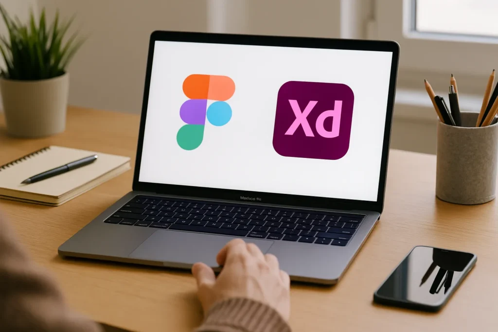
Typography gets built, tested, and fine-tuned using the right design software. Tools like Figma and Adobe XD help designers create consistent, clear, and usable layouts before anything goes live.
These tools let you try out different fonts, play with spacing, and see how your design behaves across devices. You can catch problems early and fix them fast.
Figma
Figma is a browser-based design tool that lets you create, test, and share user interface layouts in one place. It’s one of the most popular choices for UI design because it’s intuitive, fast to learn, and works straight from your browser.
It’s beneficial for teams. You can share a link to your design, get live feedback, and even collaborate with others at the same time. Need to hand off a design to a developer? Just send the link. They can inspect every layer and style directly in Figma.
You can also set up reusable text styles for headings, subheadings, and body text. That keeps your typography consistent, and editing later is a breeze. Want to test how your font holds up on mobile? Flip to a mobile frame and scroll through the preview.
Adobe XD
The desktop-based design tool Adobe XD is built specifically for creating interactive prototypes. It’s part of the Adobe Creative Cloud, so it works well if you’re already familiar with tools like Photoshop or Illustrator.
You can map out user journeys and see how pages connect, which is perfect for spotting where your typography might slow people down. XD makes it easy to play with fonts, layout, and transitions, so you can fine-tune everything before sending it to developers.
These tools help you design smarter, not harder. They give every designer a clearer way to create polished, flexible layouts with solid typography from the start.
Next, we’ll see what makes a font truly work well for websites and which ones to avoid.
Choosing the Best Fonts for Websites – What Works
Choosing the best fonts for websites means balancing looks with performance. Not all fonts are built for the web. Some look nice in a logo but fall apart when used for body text. Others may feel stylish but become unreadable on smaller screens.

Start with readability. Fonts like Inter, Open Sans, Roboto, and Lato are popular. They’re designed to be clear at different sizes, hold up well on mobile devices, and load quickly. They also support a wide range of characters, which is great for multilingual content or complex layouts.
If you want something with a little more personality, try pairing different fonts. Use one for headings and another for body text. Keep contrast in mind. Too much difference between styles can feel disjointed.
Tip: Always test your font choices in a live layout. Preview how they behave across screen sizes and on both light and dark backgrounds. Fonts can shift depending on the device or resolution, and what looks clean on your laptop might feel cramped on a phone.
Choosing fonts is about function, clarity, and creating a seamless reading experience from top to bottom. Once your fonts are in place, the next step is fine-tuning the details that most people never notice but feel.
Tabular Figures, Kerning, and Tiny Tweaks
Typography adjusts the finer details that shape how readable, trustworthy, and well-structured your content feels. Some small typographic details may be invisible at first glance, but they have a noticeable impact on how users experience your site.
Here are a few to pay attention to:
- Tabular figures: These are numbers that each takes up the same width. They’re important when you’re displaying prices, statistics, or anything in a column. Without them, numbers can look misaligned and messy.
- Kerning: Kerning is the space between specific letters. When kerning is off, it distracts readers and makes even the best fonts feel clumsy. Check headers, logos, and large text blocks for spacing that feels too tight or too loose.
- Paragraph width and line length: Lines that stretch too far across the screen can make readers lose their place. Lines that are too short break the flow. A good rule of thumb is 60 to 75 characters per line in body text, and shorter for mobile.
Our tests showed that improving these details can lift a design project’s overall feel without changing the content. They create a smoother visual rhythm and make your layout feel professionally finished.
Every Click Starts With a Font Choice
Good typography creates flow, supports your brand, and makes everything easier to understand. It helps users feel at ease, builds trust, and turns casual visitors into people who stick around.
We’ve covered how fonts influence layout, guide behaviour, and solve design problems you might not realise are rooted in text. Now’s the time to apply what you’ve learned.
Take a look at your site’s typography with fresh eyes. Does it invite users in? Does it read well on all screen sizes? If not, small changes can change everything about your web design..
Need a second opinion or a hand with a redesign? Visit GraphEdge and see how we can support your next project.