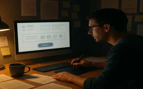
It’s easy to think web design is all about looks. Clean fonts, nice colours, sharp images, etc. But if those things don’t make the website easier to use, they don’t help much. So, understanding the design psychology becomes a must in this circumstance.
Design psychology is the idea that how something looks can shape how it feels, how people interact with it, and whether they stay or go. This article breaks down why web design is about more than appearances.
You’ll see how good choices in layout, spacing, and flow can guide a visitor without needing any words. When you understand how people behave online, you can become a designer who builds smarter, not just prettier, sites.
We’re here to discuss the psychology behind what people notice first, how responsive layouts reduce stress, why visual appeal builds trust, and the tools that help make these choices easier.
You might be designing your first website or improving one that’s already live. In both cases, you’ll find practical ways to create a stronger user experience. Grab a coffee, settle in, and let’s dive into what makes web design work.
How Your Brain Sees a Web Page
Most people decide how they feel about a web page in just 50 milliseconds, according to research from Taylor & Francis. That’s faster than you can blink. What happens in those first moments is less about reading and more about reacting. So, getting a clear idea about this concept helps you design experiences that match how the brain works, not just how a page looks.
Here are five simple ways psychology determines how users interact with a web page:
- First impressions happen fast: The brain judges layout and structure almost instantly. If the site looks cluttered or confusing, trust disappears before anything is read.
- Working memory is limited: People can only process a few things at once. When a web page is packed with competing elements, users struggle to focus.
- Too many choices create decision fatigue: If there are too many paths, people hesitate. A few clear options keep things moving.
- Consistency makes the experience feel familiar: When the user interface repeats helpful patterns across pages, it reduces stress and boosts confidence.
- Visual hierarchy tells the brain where to look: Bigger text, bolder buttons, and smart spacing guide the eye to the most important parts.
Now that you understand the basics, let’s take a look at why web design should feel smooth, not frustrating.
Why a Responsive Site Feels Effortless
Most people don’t think about screen size when they browse. They just expect everything to work. And that’s fair. Today, we move between phones, tablets, laptops, and desktops constantly.
That’s why responsive web design matters so much. It creates a consistent experience, no matter what someone is using. According to ACMA’s 2023 report, 95% of Australians use mobile devices to get online. So, if your website doesn’t adjust properly, you’re turning away most of your audience.
Small screens, big expectations
We no longer think of the phone version of a website as a backup. In many cases, it’s the main one. Users expect full access, fast loading, and clean layouts on small screens. If a site feels clunky or confusing, people will leave before you have a chance to engage them.
Design that adapts to you
Responsive design allows your layout to shift and reflow based on device and screen size. That means fewer scrolls, taps, or frustrating surprises for users. It also supports smoother interaction design, so people can browse and explore naturally without effort.
Fast, fluid, familiar
Consistency builds trust. When your website looks and works the same across different devices, users feel more confident using it. Familiar layout patterns in UI design help reduce learning curves, which enhances satisfaction and engagement.
Why We Trust Beautiful Things
Have you ever trusted a site more just because it looked better? You’re not imagining things. This reaction is a real cognitive shortcut known as the aesthetic usability effect. It’s the idea that people often assume beautiful things work better, even when they don’t.
We all do it. When a website design looks clean and balanced, it feels more trustworthy. And when it feels good, users are more likely to stay, click, and explore.
The Power of First Impressions
Visual appeal sets the way users judge functionality. If a site looks decent, users are more forgiving of small issues. Smooth colours, thoughtful spacing, and consistent design elements make a page easier to digest, even before anything is read. This creates a strong user experience from the very first moment.
Consistency Builds Confidence
When a website feels stable and predictable, users feel more relaxed. Shared layouts, repeated patterns, and familiar styling help people perceive the site as dependable. That sense of control encourages them to explore more and trust the experience.
Real-World Example
Imagine two sites offering the same content. One is clean and modern. The other looks cluttered and dated. Even if both provide the same service, most users will feel more comfortable and confident with the one with better visual appeal. That first impression makes all the difference.
The way a website looks doesn’t just matter. It shapes how it feels. And that changes everything about how people use it.
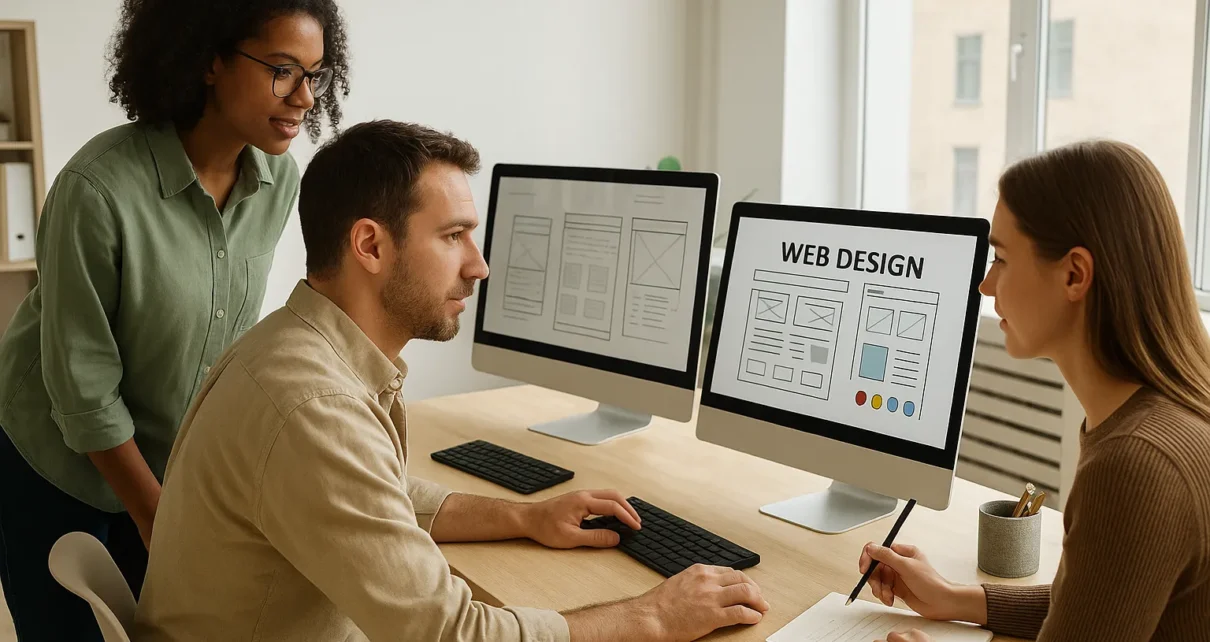
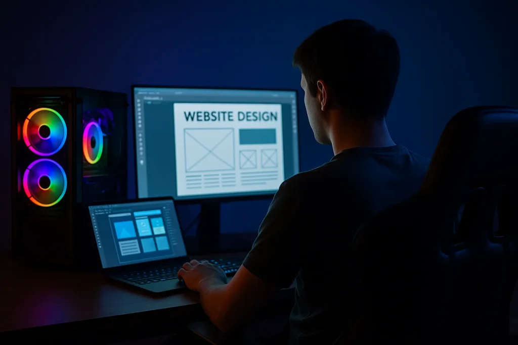
Tools That Turn Design Psychology Into Real Results
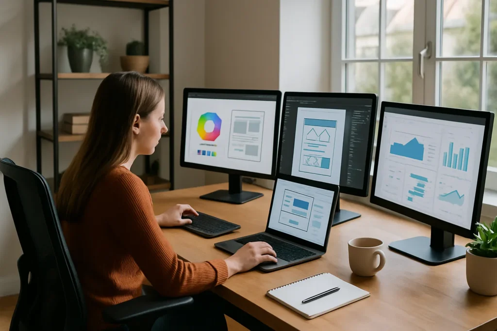
Designing with psychology in mind becomes more intuitive when you have the right tools. These platforms help you create websites that not only look good but also feel right to your users.
Figma
Figma is a cloud-based design software that enables real-time collaboration. Designers can create, prototype, and gather feedback all in one place, making the design process more efficient and cohesive. Its intuitive interface supports both beginners and professionals in digital design.
Hotjar
Hotjar provides insights into user behavior through heatmaps, session recordings, and feedback polls. These tools help you understand how users interact with your website, allowing you to make informed decisions to enhance user experience.
Adobe XD
Adobe XD is a vector-based tool for designing and prototyping user experiences for web and mobile apps. It allows designers to create wireframes, interactive prototypes, and animations, streamlining the development process.
Webflow
Webflow is a visual web development platform that lets designers build responsive websites without writing code. It combines a powerful CMS with a visual editor, giving designers creative freedom while ensuring clean, production-ready code.
Interaction Design Foundation
The Interaction Design Foundation offers a wealth of resources on user experience and interaction design. Their courses and literature help designers deepen their understanding of design principles and user psychology.
W3Schools and Codecademy
Both platforms offer tutorials on various programming languages, including HTML, CSS, and JavaScript. These resources are invaluable for designers looking to enhance their development skills and understand the technical aspects of website design.
By integrating these tools into your workflow, you can create websites that are not only visually appealing but also grounded in solid design principles and user psychology.
How to Make Your Website Feel Effortless
You know a great user experience the moment you feel it. Everything works as you expect. The layout is clear, pages load fast, and moving through the site feels easy. This is the result of good UX design. It puts users first, not just in what they see, but in how they move and interact.
Let’s start with a quick story.
A visitor clicks into a new recipe website. The menu is simple. Each category is clearly labeled. There’s a search bar front and centre. As they scroll, clean visual cues like colour-coded tags and icons show which recipes are vegetarian, dairy-free, or under 30 minutes. They find what they want fast, and they save the site for later.
Nothing flashy. Just thoughtful design that makes the experience smooth.
This is how user experience works at its best. When the user’s actions feel natural and supported, they stay longer and explore more.
You can get there with a strong design process. Start with real feedback. Watch how people actually use your site. Pay attention to the paths they take, where they hesitate, and what they ignore. Then design around that.
Each small choice, from button placement to spacing, brings your website to a deeper level of clarity and ease. And when your site feels effortless, your visitors are more likely to trust it, use it, and come back again.

The Psychology of Great Design Is in Your Hands
Great design starts with understanding your visitors. The goal is to make sure your website is helpful, clear, and easy to use. Each part of the design should support what users want to do. When the experience feels smooth, people stay longer and trust your business more. It’s that simple.
Using psychological principles helps you create designs that feel natural. You can guide users by making smart choices about layout, spacing, and wording. The better your design fits the way people think, the easier it is for them to use.
Moreover, you don’t need special tools or a big team. What you need is a simple, focused approach that starts with how your users think and move.
If you want more ideas, explore these web design tips and trends from GraphEdge. They share real advice for building websites that look great and work well for your target audience.