You’ve probably visited countless websites, but how many actually stuck with you? The ones that just looked good?
If you thought of the second, well then, you’re in the right place! What actually makes a site stand out is the story it tells. It connects with visitors on a deeper level and helps boost conversions. Not convinced yet?
In the sections ahead, we’ll show you how to create that kind of experience using layout, copy, and emotional design choices and why this all matters for turning visitors into loyal customers.
Let’s start with a look at how storytelling actually plays out on a website.
Storytelling in Web Design Explained
Storytelling in web design means understanding your users, building empathy, and designing in a way that speaks to them emotionally. We are not talking about dramatic narratives or long-winded content.
Instead of presenting content all at once, it builds meaning step by step. So visitors don’t just read through sections, they feel like they’re part of something.
That connection begins the moment you show them something familiar (that little moment of “yep, this is for me”). From there, introduce a challenge they might relate to, and guide them through a clear, helpful solution, one step at a time.
Throughout the experience, thoughtful design and a tone help keep things warm and easy to follow. And when everything clicks, the final action doesn’t feel like a pitch but rather the natural next step in a conversation that made sense from the start.
So, what turns a good experience into a memorable one? It often comes down to emotion. Let’s understand the emotional impact from the root.
Emotional UX: The Feeling That Keeps Users Coming Back
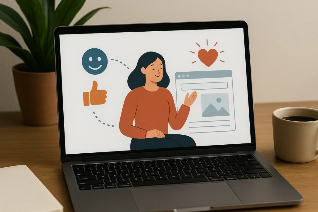
Emotional UX is the part of web design that focuses on how users feel while interacting with your site. It specifies the emotional experience, not just the functional one, and plays an important role in whether people connect with your content or not.
That’s why you can’t ignore emotional design nowadays. While most UX principles aim to reduce friction, emotional UX adds something valuable in return. It builds trust, comfort, and sometimes even delight.
These small emotional signals can make the real distinction between someone clicking away and someone choosing to explore further.
Here’s how you can design for emotion in ways that feel intentional and useful:
Start with empathy
Begin by considering what users might be going through when they land on your site. Are they anxious? Curious? Frustrated? Your design should respond to that mindset.
For example, a financial site with calm colours and clear navigation can help reduce stress and create a sense of reassurance among visitors.
Why? It’s because calming colors like blues and greens have been shown to lower heart rates and ease anxiety. And when you add in a clear and simple layout, it becomes even easier for the brain to process information without feeling overwhelmed.
Use language that connects
The tone of your writing matters. Speaking directly to the user with friendly, clear language helps build a relationship quickly.
So, how to do that? Say “Let’s get started” instead of “Begin process.” Though it’s simple to hear, it makes the experience feel more personal.
Create comfort through design
A clean, well-spaced layout gives users breathing room. Colour choices should align with the feeling you want to create, such as soft blues for calm, brighter tones for energy, and darker colours for trust and stability.
Every detail plays a role in how users feel as they move through the site.
Add human touches
Small design choices impact the emotional part of readers by creating subtle moments of recognition, comfort, and care. Microinteractions, like a gentle hover effect or a progress bar that responds as a user completes a task, can make the experience feel alive and thoughtful.
These touches build a sense of trust.
Include cues that guide emotions
Use visuals that reinforce the tone of your content.
Faces in photography help build relatability. Icons, illustrations, and even whitespace can guide the user’s attention while supporting the emotional message you want to convey.
Adapt for cultural context
Emotions aren’t universal. A design that feels friendly and relaxed in one place might feel unprofessional elsewhere.
That’s why emotional UX works best when it’s tailored to the expectations, habits, and cultural preferences of your specific audience.
Success in emotional UX isn’t always measured in click-through rates (CTR) or form completions. Sometimes, it’s in the words people use when they talk about your site. If you hear things like “easy to use,” “friendly,” or “felt simple,” you’re doing something right.
These kinds of responses usually come from the design that feels thoughtful, created with supervision, and genuine attention to the user’s experience.
Now let’s take it a step further and see how you can build that same feeling into every part of the user’s journey.
Building a User Journey That Feels Like a Story
No one wants to figure out how a website works. They want it to make sense right away, without effort or second-guessing.
That’s why a decent user journey design is the prime factor here. When done well, users don’t feel like they are going through a system.
Instead, they feel like they are being guided step by step. The experience becomes smooth, intuitive, and comfortable. And when that journey mirrors the shape of a story, it becomes even more powerful.
A good website flows like a conversation. It starts with a clear idea, builds interest, offers support, and leads to a confident next step. Each section should feel like a continuation of the last.
Here’s how to design that kind of journey:
Start with a Strong Hook
The first few seconds of a visit can decide whether someone stays or leaves. That’s why your opening should instantly communicate value and relevance. A clear headline, engaging visual, or bold statement can make visitors feel they are exactly where they need to be.
For example, a parenting course website might lead with the line, “Feeling overwhelmed? You’re not alone.” Combined with a warm, relatable image, this kind of opening creates an immediate connection.
Reveal Benefits Gradually
Once you have their attention, it’s important not to overwhelm them with too much at once. Instead of listing every detail upfront, guide visitors through the information in a logical, easy-to-digest flow. Each section should offer just enough to keep them moving forward.
You might start with a brief overview of your offering, then follow with sections like “What You’ll Learn,” “Why It Works,” or “Who It’s For.” This kind of pacing makes the experience feel natural and manageable.
Use Design to Guide Attention
A good layout helps your story come through clearly. If you use clear headings, enough spacing, and consistent alignment, your visitors will find it much easier to follow along without distractions.
On a service page, for example, using bold headings can help break up big chunks of text, making it easier to read. Placing contrasting buttons near important spots also helps grab attention without feeling pushy. Remember, your design should support your content.
Support the Journey with Emotion
As users move through your site, they should feel something that matches their intent. The emotional tone of your words, images, and colours plays a big role in how users respond. Matching this tone to your audience builds comfort and trust.
A wellness brand might use calming colours, slow-moving visuals, and soft language to promote relaxation. A fitness site, on the other hand, might rely on high-energy visuals and confident language to inspire action.
End with a Clear, Inviting Step Forward
When someone reaches the end of your page, they should know exactly what to do next. A call to action should feel like the next logical step in the journey, not a sudden interruption or sales pitch.
For instance, instead of saying “Buy Now,” a softer prompt like “Book Your Free Intro Call” or “See How It Works” feels more helpful and less forceful. It gently invites the user to continue, building on the trust already established.
When each part of the experience flows naturally into the next, your site becomes a story that users feel part of. And when that happens, trust follows.
Of course, guiding users through a journey is not just about layout or words. The way you use visuals plays a huge role in how that story is told. Let’s look at how images, colour, and movement help shape the narrative.
Visual Storytelling: Layout and Media That Lead the Way
Words can explain. But visuals make people feel.
Visuals are a big help when it comes to storytelling in web design. They set the mood, guide your eyes to what matters most, and back up the main points you want to get across.
They allow users to absorb meaning at a glance, follow the intended path through the content, and connect emotionally as they go. Rather than relying heavily on text, a well-chosen image or colour palette can instantly tell users what kind of experience to expect.
Here’s how to use visual storytelling to support your message:
Use Layout to Create Structure
A clean, consistent layout helps users feel grounded. When content is grouped logically and there’s enough white space between sections, the page becomes easier to scan and more pleasant to read.
For example, a pricing page with clearly separated plans and uniform spacing feels approachable, while a cluttered layout creates confusion.
Guide the Eye with Visual Hierarchy
Good design leads users naturally from one point to the next. Using large headings for key ideas, smaller subheadings for support, and clean body text keeps content easy to digest. Contrast and positioning also matter.
A homepage that opens with a bold headline, followed by a brief description and a well-placed button, creates a clear path for the eye to follow.
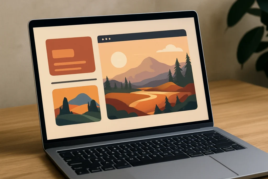
Choose Imagery That Supports Emotion
Every image on your site should reflect the tone of your message. Photos of real people help build trust and make your brand feel more relatable. Illustrations can also add some personality or a playful touch. And abstract visuals are great for setting the mood, especially in fields like tech or wellness.
For example, a nonprofit might use heartfelt images from the field, while a design studio might lean into bright, playful graphics.
Use Colour Intentionally
Colour is another powerful part of your visual story. It influences how people feel, often instantly. For example, soft blues create calm, while bold reds can signal urgency. Try to choose a palette that fits both your brand and the tone you want to convey.
Another good example of this could be a meditation app. An app trying to soothe you might rely on gentle, muted tones, whereas a fintech platform could use sharp contrasts to communicate focus and clarity.
Add Movement to Guide or Delight
Once visuals are aligned, motion can add an extra layer of guidance and personality. Subtle animations help bring the page to life without overwhelming the user.
Small touches like a fade-in effect, hover responses, or smooth scrolling transitions can guide attention and create moments of delight.
For example, a creative portfolio might use hover animations to reveal project details, encouraging interaction in a simple, engaging way.
So, it’s clear that visual storytelling works best when it feels subtle and intentional.
Coming up next, we’ll talk about how to bring all of these elements together into a cohesive structure, using familiar storytelling frameworks that make planning and building easier.
How to Implement This: Tips and Frameworks

Around 75% of customers believe brands should be telling stories. So that makes it worth getting right. But you don’t have to start from scratch. The easiest way to begin is by using a familiar structure.
Use a Familiar Story Structure
Frameworks like the “Hero’s Journey” or the “Problem–Solution–Outcome” model are perfect for guiding content. They help you organise your message in a way that mirrors how people think. Start by identifying the user’s challenge, walk them through how you solve it, and end with a clear next step.
For example, a landing page for a project management app might open with, “Tired of juggling deadlines and emails?” then introduce the solution, highlight key features, and finish with, “Start your free trial today.”
Storyboard Your Pages
Before diving into a design tool, sketch out your key sections like scenes in a story. This helps you visualise how the message flows and ensures that each part of the journey supports the next.
Think about what users see first, what they need to understand next, and when they should feel ready to act. You can open with a customer quote, follow with core benefits, introduce social proof, and close with a strong call to action. This kind of structure helps the site feel intentional and easy to follow.
Match Content to User Intent
When visitors land on your page, they come with questions that change as they scroll. At the start, they’re looking for reassurance or clear answers. As they move down, they want more details. And by the time they reach the end, they’re ready for proof and a good reason to take action.
So, let’s say you’re making a service page for a home cleaning business. You don’t want to start with just a list of services.
Instead, match your tone and details to what your visitors need at each stage. Start with a friendly headline to welcome them, then share a benefits list that answers their practical questions. Add a testimonial or case study to build trust, and finish with a call to action that feels like the next easy step.
Use Tools That Support Visual Storytelling
Once your content is aligned with intent, you can use tools to see how it all feels in action. Design platforms like Figma and Adobe XD let you create page prototypes that show the flow clearly. Then, tools like Hotjar or Microsoft Clarity can help you understand how visitors interact with your content by showing where they pause, scroll, or leave.
If you notice that users are skipping a section, you can adjust the spacing, simplify the text, or add an image to re-engage their attention. These small tweaks can keep your story on track.
Track the Right Metrics
As you adjust and refine your design, it’s important to track how the story performs. Not every metric tells you how your story is landing, but some give real insight. Scroll depth, time on page, bounce rate, and heatmaps can show where users are engaged and where they lose interest.
If users are bouncing before they reach your call to action, that could be a sign that the story loses momentum. Maybe it needs more emotional build-up or a clearer value proposition. Use what the data tells you to refine both structure and delivery.
Implementing storytelling simply means designing with purpose. Every headline, section, and design element should work together to guide the user toward understanding, connection, and action.
Start Designing Your Website with a Compelling Story
A website can be functional and still forgettable. But when it tells a story, one that users feel part of, it becomes something exceptional and attractive to visitors.
The first part of good storytelling in web design is understanding your users. When you know what they care about and what they’re looking for, it’s easier to design a journey that feels natural and builds trust along the way.
The result? Higher engagement, better conversion, and a site that people remember.
If your current site feels flat or disconnected, sometimes all it needs is a clearer story.
Start simple. Focus on one page. Apply the principles we’ve covered: relevance, emotion, pacing, and structure. Then test, learn, and refine.
When your website feels like it was made for your audience, your audience will respond.