You’re in bed, lights off, phone in hand. Just one more scroll before sleep. And then, bam! That bright screen brightens up like a spotlight, making your eyes squint and water. It’s the kind of moment that makes you wish your favourite apps were a bit easier on the eyes.
Dark mode solves this problem by taking the usual layout with dark text on a light background and flipping it. This move helps your eyes adjust better in dim light, lowers screen glare, and can even stretch your battery life on certain screens. It also gives your design a cleaner, more polished look that fits with today’s web design trends and real-world user experience needs.
In this post, we’ll cover what makes dark mode work well, where designers often make mistakes, and how to create a version that’s both sharp and easy to use. You’ll also find tips for accessibility, testing, and keeping your brand identity intact.
There’s a smarter way to handle dark mode, and you’re about to learn it. Let’s get started.
What Is Dark Mode and Why It’s More Than Just a Trend
Dark mode switches the usual colour setup so that light text and elements sit against a darker background. This overturns the usual layout of dark text on white background and creates a more subtle experience. It’s especially handy when you’re using your screen at night or in low-light spaces.
Dark mode has become a big deal in modern UI design. For many users, it’s become the preferred way to browse, scroll, and work. A study in 2023 found that over 81% of smartphone users prefer dark mode when it’s available. Designers and brands are paying attention for good reason.
Benefits of Using Dark Mode
- Gentler on your eyes: Bright backgrounds can be a pain to look at in dim settings. Dark mode softens the screen’s impact and helps reduce visual fatigue, especially after hours of use.
- Can save battery on OLED devices: OLED screens don’t light up black pixels, so using dark colours can reduce power usage. That means your phone or tablet might last a bit longer between charges.
- Feels modern and sharp: A dark interface brings a sleek, focused feel. It draws attention to your content and trims away distractions, lining up with current web design trends.
Big brands like Google, Apple, Twitter, Instagram, and YouTube have rolled out dark mode across their platforms because more users are asking for it, and it helps create a smoother user experience across day and night usage.
Pro Tip: Always test text legibility in different lighting conditions to make sure users aren’t struggling to read. According to Nielsen Norman Group, dark mode can reduce readability if contrast isn’t carefully managed.
The Psychology Behind Dark Interfaces
Dark interfaces usually feel smoother and refined because they remove noise. When backgrounds fade into deep greys or near-black shades, the content takes centre stage. That simplicity brings focus and calm, increasing user satisfaction.

Psychologically, darker tones create a sense of luxury, depth, and professionalism. They reduce the number of light sources your brain has to process, which lowers cognitive strain and helps users stay involved longer.
In design and marketing, that extra sense of focus is a huge advantage. Dark mode helps you control visual hierarchy, direct user attention, and build brand atmosphere without changing your layout.
Best Practices for Designing in Dark Mode
Contrary to popular belief, designing for dark mode isn’t limited to switching colours. If it’s done right, it improves user experience by making interfaces easier on the eyes, more energy-efficient on OLED screens, and visually sleek.
But it only works if the design choices are intentional. Without proper structure, contrast, and colour handling, dark mode can actually become harder to use than its light counterpart.
These best practices help you avoid the usual problems and create a layout that feels polished, accessible, and genuinely helpful in low-light conditions. Let’s break them into steps.
- Step 1: Avoid Pure Black and Pure White
True black (#000000) sometimes feels too harsh. It flattens the entire interface and can cause eye strain, especially in high contrast settings.
Similarly, Pure White (#FFFFFF) text can feel glaring against dark backgrounds. Instead, use softer shades like dark grey (#121212 or #1E1E1E) for backgrounds and Off-White or Light Grey for text.
These tones are easier on the eyes and help maintain visual balance. - Step 2: Maintain Contrast Ratios
Contrast ratio is the difference in brightness between foreground and background colours, used to ensure text and elements remain readable.
The WCAG (Web Content Accessibility Guidelines) 2.1 recommends a minimum contrast ratio of 4.5:1 for Level AA body text to ensure legibility. This is especially important in dark mode, where contrast can easily dip below readable levels.
Tools like WebAIM’s Contrast Checker help test your design before launch. It’s worth testing both text and UI components like buttons and icons to ensure everything is accessible for users with visual impairments or in varying lighting conditions. - Step 3: Think in Layers
Light mode benefits naturally from shadows and bright backgrounds, but dark mode requires finesse to build depth.
Use layered shadows, subtle gradients, and slight elevation to separate content. Elements like modals, cards, and buttons should stand out just enough to feel clickable without disturbing the visual hierarchy. - Step 4: Use Colour Carefully
A bright accent that works on white might appear neon or jarring when placed on a charcoal background. So, you have to be precise when choosing colours for your dark mode.
Desaturate your bright colours slightly and test how they look against multiple dark tones. Consider using “tone-on-tone” strategies that use different tints or shades of the same colour to create a sophisticated look. You can try this strategy with muted colours for an elegant look.
Also, avoid relying on colour psychology alone to convey meaning. Test out multiple colour combinations and see what works well. And for clarity, you should add icons or underlines. - Don’t Just Invert Colours, Reimagine and Rebuild
Automatically inverting your light theme is a shortcut that rarely works. Visual weight shifts on a dark background, and your carefully balanced light layout might feel off or confusing when simply reversed.
Rebuild layouts with dark mode in mind. Start from a fresh perspective and redefine typography, spacing, icon style, and interactive elements so they feel intentional in the darker setting.
Design Audit Checklist for Dark Mode
Before you roll out your dark mode, run through this quick audit:
- Have you replaced pure black with dark greys for a softer look?
- Is all text and icon contrast above WCAG 2.1 minimum standards?
- Are components layered properly using shadows or elevation?
- Have your primary and secondary brand colours been adjusted for dark backgrounds?
- Did you design dark mode separately from the light theme, rather than auto-inverting styles?
A solid dark mode shows your users that you’ve thought carefully about their environment, habits, and comfort. That kind of attention builds trust, one screen at a time.
Accessibility in Dark Mode: Designing for Everyone
In UI and UX, accessibility means making sure that every person, regardless of ability, can use your website or app with ease. That includes people with low vision, colour blindness, or other sensory differences.

Dark mode may ease eye strain for many, but it can create real challenges for users with specific visual needs. Unchecked colour combinations can also confuse users who rely on colour distinction to understand status or alerts. Let’s take a look at a real-life example here.
Harry from Melbourne has mild contrast sensitivity issues and relies on clear visual separation to navigate apps. On one app with a mandatory dark theme, light grey text on a near-black background left him squinting, guessing where buttons were, and eventually abandoning the app altogether.
Here’s how to make dark mode accessible:
- Increase font sizes and line spacing for easier reading
Small text can get lost in dark backgrounds, especially for users with low vision or reading difficulties. Increasing font size and spacing helps the eye track text more easily and reduces strain during longer sessions. - Offer a light/dark toggle so users can choose
Giving people control over the theme lets them pick what’s most comfortable for their eyes and environment. - Avoid oversaturated colours that glow on dark backgrounds
Bright reds, blues, and greens can look overwhelming or even painful against dark tones. Toning these colours down helps maintain balance and keeps buttons, icons, and alerts from becoming distracting. - Test contrast using tools like WebAIM’s Contrast Checker
Good contrast is what keeps text readable and elements clear. A quick test with tools like WebAIM’s Contrast Checker helps you meet accessibility standards and spot problem areas early in the design phase.
Accessibility Checklist for Dark Mode
Designing a dark interface involves making sure it actually works for everyone. You’ll need to check that it’s usable for people with different visual needs.
Here’s a quick list to guide your design process and help you avoid common accessibility mistakes:
- High enough contrast between text and background
- Avoid relying on colour alone for key actions or alerts
- Offer user-controlled theme toggles (not just system default)
- Support screen readers with clear, labelled elements
- Use readable font sizes and allow scaling for larger text
- Test your design in both dark and light conditions
- Check how your colours appear to users with common forms of colour blindness
- Minimise the use of saturated colours that can appear too intense on dark backgrounds
This checklist helps ensure your dark UI isn’t just stylish but actually works well for everyone using it.
Putting It to the Test: User Research & A/B Testing
Now it’s time to see how real users actually interact with your dark mode. User research and A/B testing are both tools that help you understand how people interact with your design in the real world.
User research involves observing or speaking directly with users to learn how they experience your product. It shows what works, what’s confusing, and what could be improved. On the other hand, A/B testing compares two different versions, such as light mode versus dark mode, to see which one performs better based on data like clicks, time on page, or drop-offs.
Why Testing Matters
When it comes to dark mode, testing is necessary because it’s really tricky to get the design right. Elements may look polished in your design file but appear flat or unreadable on certain screens. Also, colours behave differently on dark backgrounds, and small contrast issues can lead to serious usability problems.
Without testing, you’re relying on assumptions. But with testing, you can catch those issues early and build a version of dark mode that actually functions well for real users.
UX expert Jared Spool once said regarding user behaviour, “It’s vital that you observe your users yourself” That’s especially true for dark interfaces, where visibility and clarity can easily go wrong. So, getting direct feedback from your users is extremely important.
Ways to Test Your Dark UI
Before rolling out dark mode, try these methods to understand how it performs in the real world:
- Heatmaps: They show where users click, scroll, and hover most often. In dark mode, you may find that key buttons or links aren’t drawing attention as expected. Use this data to adjust colour, spacing, or layout to guide focus effectively.
- Eye-tracking studies: It tells you where users are looking in real time. If they’re missing important actions or wandering visually, it might signal weak contrast or poor hierarchy. This is especially useful when testing onboarding flows or checkout pages.
- Direct feedback sessions: Sit down with users, watch how they use your dark mode, and ask what they think. Their words can uncover emotional responses like“clean,” “too dim,” “elegant,” or “hard to read”, which metrics alone won’t capture. Look for patterns in their frustrations and compliments.
- A/B testing light vs dark: Release both light and dark versions to different user groups. Track things like time on page, task completion rates, and bounce rates. If dark mode causes more drop-offs or slower performance, dig deeper into layout or accessibility issues.
Tools to Help
Platforms like UsabilityHub, Maze, and Lookback make it easier to conduct these tests at scale. They help collect user data, screen recordings, and surveys without having to build your own testing system from scratch.
Sample Feedback Questions to Include
Asking the right questions helps turn vague impressions into useful design directions. These questions target readability, usability, and user comfort. They are major factors in dark UI performance. They also make it easier to compare light and dark mode experiences side by side.
- Did anything feel difficult to read or locate?
- Was the dark background comfortable for your eyes?
- Would you prefer this layout in light mode?
- What time of day do you usually browse this kind of content?
- Were there any colours or elements that felt out of place?
These questions help you pinpoint what needs fixing, what’s working, and how users actually feel.
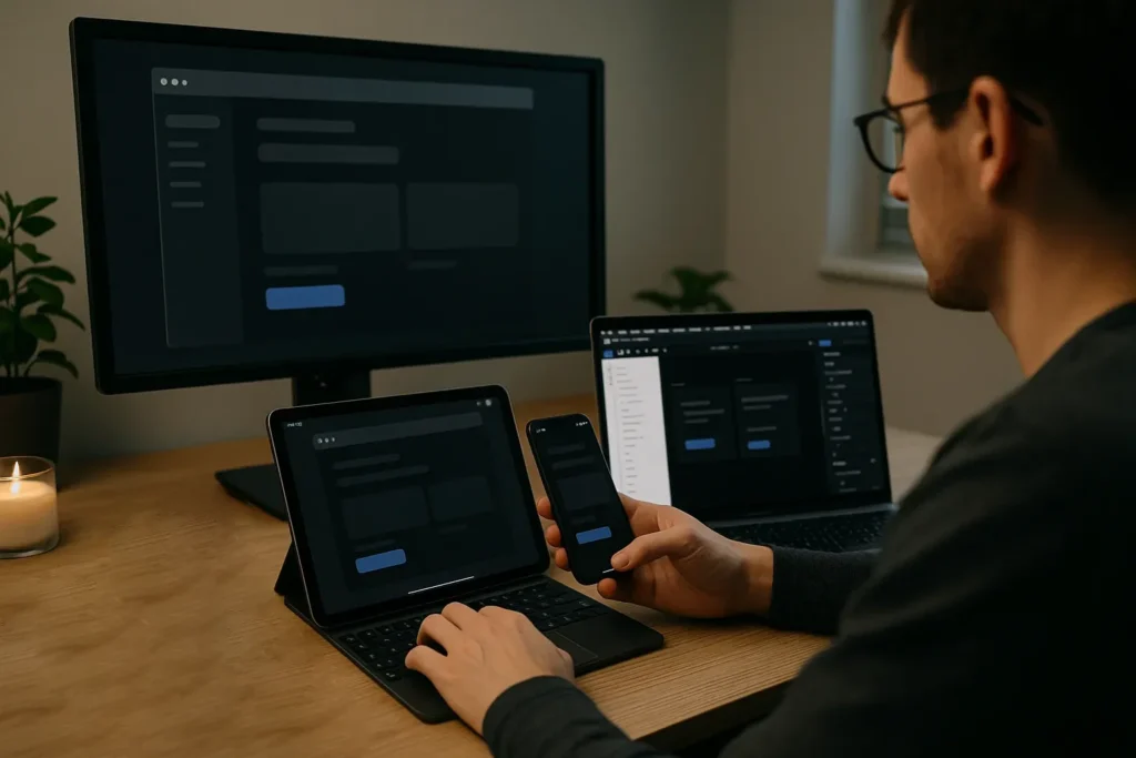
Cross-Platform Consistency in Dark Mode
Cross-platform consistency means your dark mode behaves and looks right no matter where it’s viewed, whether that’s on a desktop, tablet, or phone. Users expect a smooth experience as they move between devices. That means spacing, font clarity, and contrast need to scale properly, and navigation needs to stay clear and accessible.
Common Mistakes: Android vs iOS
Android and iOS each handle dark mode differently. Android allows more theming flexibility, which can lead to inconsistencies if not tightly controlled. And iOS enforces stricter system rules that may override your custom styles.
Ignoring these differences can result in awkward spacing, missing elements, or readability issues that only show up on one platform. Here’s how they differ in their control:
| Area | Android | iOS |
| System UI support | More flexible with custom theming | Follows stricter native guidelines |
| Font scaling | Often scales automatically | May require manual adjustments |
| Navigation elements | Can be shifted or hidden by default | Consistent but tighter spacing |
| Default dark mode | Varies by manufacturer | Tied closely to system settings |
Our analysis has shown that designers usually ignore how platform-specific rules impact layout. You should always design with both in mind and test early on real devices to catch these problems before launch.
Use Component-Based Systems and Test Across Devices
Component-based design refers to breaking your UI into reusable parts like buttons, cards, and headers. By applying consistent styling rules across components, you reduce layout differences.
Tools like Figma, Storybook, or Flutter make this easier. However, always test dark mode on both Android and iOS using real devices, not just emulators.
Real Example and Quick Fix
In one app, a dark mode button looked perfect on desktop but disappeared on Android mobile because it lacked background elevation. The fix was to add subtle shadows and padding that responded to screen size. Small tweaks like this preserve usability and avoid unwelcoming surprises.
If you take a Mobile-First Design approach, it’ll ensure that your dark mode will adapt properly instead of shrinking. That’s what keeps your design functional and sharp across every screen.
Quantifying Success: How to Measure the Impact of Dark Mode
Measuring performance helps you understand how your design choices affect real behaviour. It shows whether dark mode enhances usability, encourages longer visits, or simply offers a nice visual change with no real value.
With the right metrics, you can fine-tune your approach based on what users actually do instead of simply relying on what they say they prefer.
Key Metrics to Track
To understand if dark mode is achieving its goal, you need to track how it affects actual behaviour. The following metrics give you a clearer view of how users interact with your site when dark mode is enabled.
- Bounce rate: A lower bounce rate in dark mode may indicate improved first impressions or better readability. But if users leave quickly, it could mean something in your layout or colour contrast isn’t working.
- Session time: If users are sticking around longer, your dark mode might be helping reduce fatigue or visual discomfort. Longer sessions generally point to smoother navigation and better overall engagement.
- Night-time usage: Monitor usage during evening hours to see how your dark mode performs when it’s most needed. A spike in evening engagement may signal that users feel more comfortable browsing in darker environments.
- Dark mode opt-in rates: If you offer a toggle, track how many users are choosing the dark option. A high opt-in rate shows users trust your implementation and find it useful.
Recommended Tools
These tools help collect detailed data, track interactions, and reveal what users actually experience. Let’s see what they are.
- Google Analytics (with custom events)
Track session duration, theme selection, and bounce rates based on the active theme. Custom dimensions can also help isolate patterns specific to dark mode users. - Hotjar or Microsoft Clarity
Use session recordings and heatmaps to understand user interactions in both light and dark modes. These tools make it easier to spot points of confusion or visual elements that aren’t working.
Real-World Example: Airbnb’s Dark Mode A/B Test
Airbnb implemented a dark mode feature aimed at enhancing user comfort during late-night browsing. An A/B test revealed that users who engaged with the new night mode experienced a 15% increase in conversion rates compared to those using the standard light theme.
This case shows how thoughtful design adaptations, like introducing a dark mode, can lead to measurable improvements in user engagement and conversion metrics.
Brand Considerations: Staying ‘You’ in the Dark
Brand consideration is the process of ensuring that your design choices reflect and support your brand’s identity, voice, and visual style across all platforms and settings. In dark mode, you only need to balance it well.

You want your interface to stay accessible and visually appealing while still feeling like “you”. That means refining your colour palette and adjusting how elements appear in low-light settings.
The goal here is to adapt dark mode thoughtfully. Overly bright colours may clash or glow harshly on dark backgrounds, while muted tones can blend in too much. You’ll need to test and tweak, keeping both visual comfort and brand recognition in mind.
If you can handle it properly, dark mode will become another extension of your identity. It’ll be easier on the eyes and still on-brand. Now let’s look at how others are doing it right.
Examples of Brands That Got It Right
- Slack’s dark mode tones down its bright purples and greens into deeper, more grounded shades while keeping its overall style unmistakable.
- Spotify uses black backgrounds with electric green highlights, staying bold and recognisable without sacrificing comfort or clarity.
- Duolingo’s dark mode keeps its playful tone intact by using deep greys paired with softened versions of its bright green and yellow brand colours. It maintains a fun, accessible feel without overwhelming the user’s eyes in low-light settings.
Tools for Testing and Adapting Brand Colours
Before launching, it’s worth using the right tools to preview how your brand looks in a darker setting. These help simulate real conditions and uncover contrast issues early.
- Colour swatch adaptors
These tools convert your primary palette into darker tones while preserving visual harmony. They’re useful for comparing side-by-side versions and avoiding clashing combinations. - Figma plugins
Plugins like Dark Mode Magic or Themer help automate dark theme creation in design files. They let you preview and tweak styles without rebuilding from scratch.
Up next, we’ll look at the most common mistakes designers make when adapting to dark mode.
Common Mistakes to Avoid with Fixes
Sometimes, designers rush through the process, copy their light theme to invert it, or overlook how colours and depth behave differently on darker backgrounds. These shortcuts can make interfaces hard to read, uncomfortable to use, or completely misaligned with the brand.
Taking the time to avoid these common mistakes helps you create a dark mode that feels smooth, functional, and thoughtfully designed.
- Relying Too Heavily on System Defaults
Some designers assume the operating system’s built-in dark theme settings will handle all the heavy lifting. But system defaults don’t always account for your brand colours, icon clarity, or custom UI components.
Customise your dark theme instead of depending on platform presets. Use your design system to fine-tune the look and ensure it fits your overall visual identity. Leaving this to the system can make your interface feel disconnected from the rest of your brand. - Using Transparent Overlays Without Testing
Dark overlays on dark backgrounds may lead to messed up interfaces where nothing stands out. It becomes especially hard to distinguish between layers, cards, or modal windows.
Always check how transparent elements appear across different screens and lighting conditions. Use semi-transparent white instead of black to achieve clearer layering. - Forgetting State Indicators
Hover, active, and focus states mostly get ignored in dark themes, making it harder for users to know what’s interactive. This breaks user flow and forces them to guess what’s clickable or editable.
Design clear, visible state indicators with thoughtful contrast and colour. Ensure buttons, links, and form fields visibly respond to interaction. - Leaving Images and Icons Unoptimised
Icons and images that look sharp in light mode can disappear or clash in dark environments. Inconsistent icon colours and unsupported file types can cause important elements to vanish entirely.
Use SVGs or adaptable icon sets that adjust colours based on background. Add a subtle outline or shadow to icons where necessary for visibility. - Ignoring Text Tone and Mood
Text colour might technically pass contrast checks, but still feel irritating or out of place. Colour choices that look fine in testing tools can still feel too loud or harsh in real use.
Adjust your colour for tone as well as visibility. Use softer reds or warmer tones for alerts, and test how they feel, not just how they look.
Fixes Checklist
This quick checklist helps you catch the dark mode details that are commonly disregarded. Use it before launch to ensure your interface feels refined, accessible, and truly user-friendly across all platforms.
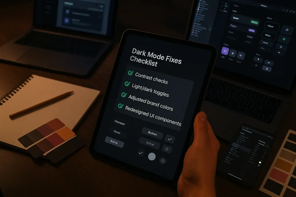
- Replace full black backgrounds with dark greys to reduce harshness
- Use a contrast checker to maintain readability across text and UI elements
- Adjust brand colours to avoid oversaturation or visual discomfort
- Provide a light/dark toggle so users can control their experience
- Redesign UI components like buttons, icons, and form fields specifically for dark mode
- Avoid relying solely on OS-level dark mode defaults
- Review and test overlays to ensure clarity and separation between layers
- Add clear interaction states (hover, active, focus) that remain visible in dark settings
- Optimise icons and image assets to maintain visibility and consistency
- Use colour tones that not only meet contrast standards but also support the right emotional tone
A solid dark mode design balances aesthetics, comfort, and clarity. This checklist helps you hit all three without sacrificing your brand’s voice or your users’ experience.
Make Dark Mode Work Harder for You
Dark mode is a smart way to improve readability, reduce eye strain, and keep users engaged. But getting it right demands extra work from you, and calls for careful contrast, testing on real devices, and making sure your brand still feels like “you”.
We’ve covered what works in dark mode, where things usually go wrong, and how to build a dark UI that’s both sharp and user-friendly. From choosing the right shades to reduce glare, to testing on real users and adjusting for mobile, every detail matters. When these pieces come together, dark mode becomes a thoughtful, well-designed experience that feels smooth, readable, and right at home with your brand.
If you’re ready to apply these ideas, GraphEdge is here to help. Our team offers hands-on design support, expert testing, and practical tools to make dark mode work the way it should.
Take the next step today and create a dark mode experience your users will actually enjoy.