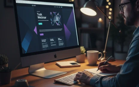
Outdated web design signals to visitors your business hasn’t kept up with how people browse and make decisions online today. When your site looks stuck in 2010, potential customers question whether your services match current standards. Because design trends that worked years ago now push users away before they even read your content.
Most websites lose visitors within seconds because clunky elements feel confusing on modern devices. For instance, your site might load slowly, display poorly on phones, or lack the interactive features people expect.
This article covers the specific web design trends that separate modern sites from dated ones. So, you’ll learn which outdated elements hurt your credibility, what design trends users expect now, and practical steps to bring your website up to current standards without starting from scratch.
Let’s get started.
Why Modern Website Standards Are Non-Negotiable in 2026
Modern website standards are non-negotiable because visitors now expect fast, mobile-friendly sites, which work smoothly across all their devices.
Behind that shift, the web browsers now render websites differently than they did even two years ago, and technology keeps raising the bar for what counts as acceptable performance. Here’s what defines modern web design and why ignoring these standards costs you customers:
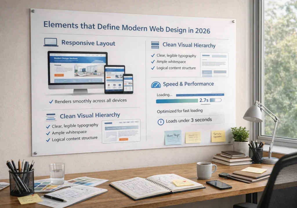
Elements that Define Modern Web Design in 2026
Responsive layouts adapt ideally across devices, from desktop monitors to mobile phones to tablets.
You should implement this because your web pages need to rearrange content automatically so visitors get the same quality experience regardless of screen size.
Besides, clean visual hierarchy uses whitespace, typography, and colour contrast to guide user attention naturally. This way, when you structure information clearly, users find what they need without hunting through cluttered pages. It means larger headings for important points, breathing room between sections, and consistent formatting that makes scanning easy.
Generally, fast loading speeds under three seconds keep visitors from abandoning your site (and yes, we’ve all rage-quit a slow-loading site at least once). Plus, search engines track page speed as a ranking factor, so slow websites drop lower in results even if your content is excellent.
The Cost of Ignoring Latest Web Design Trends
Visitors leave within seconds if your site looks outdated or loads slowly on their devices. The reason this happens is that people now compare every website they visit against the latest web design trends they see on major platforms and competitors’ sites.
On top of that, search engines rank modern, fast-loading sites higher than slow or unresponsive ones in results. Plus, Google’s algorithms specifically measure how well your pages work on mobile devices and how quickly users can access your features.
The majority of potential customers question your business’s credibility when your website feels stuck in 2010. Furthermore, if your digital presence looks neglected, they assume your services might be outdated, too.
Here, first impressions count online, and an old-fashioned site makes people wonder if you’re still in business.
Outdated Web Design Elements That Push Visitors Away

Ever landed on a site and immediately hit the back button because something just felt off? Yeah, that’s your brain recognising outdated web design even before you consciously process what’s wrong.
Let’s look at the specific elements that make websites feel dated and why they damage your user journey:
Static Layouts vs. Micro Interactions
Static pages with structured layouts feel lifeless compared to sites with subtle hover effects and interactive elements. You can feel it immediately when you click a button, and nothing happens until the next page loads.
Meanwhile, micro interactions and micro animations like button animations confirm user actions and make browsing feel more natural. These small details include colour changes when you hover over links, smooth transitions between sections, and visual feedback that shows the web page is responding.
Also, modern users expect this kind of interactivity because most websites they visit now include these features.
Missing Dark Mode and Mobile Responsiveness
Sites without dark mode options cause eye strain and ignore user preferences for comfortable browsing. You might be wondering why this counts so much. Well, people who browse at night genuinely appreciate having such a choice.
Over 60% of site traffic comes from mobile devices, so making thumb-friendly mobile navigation and a responsive design is essential now. On the flip side, layouts that aren’t mobile-friendly force users to pinch, zoom, and scroll horizontally to read basic web pages.
Remember: When your page doesn’t adapt to smaller screens or work like mobile apps do, visitors don’t get the same experience desktop users enjoy.
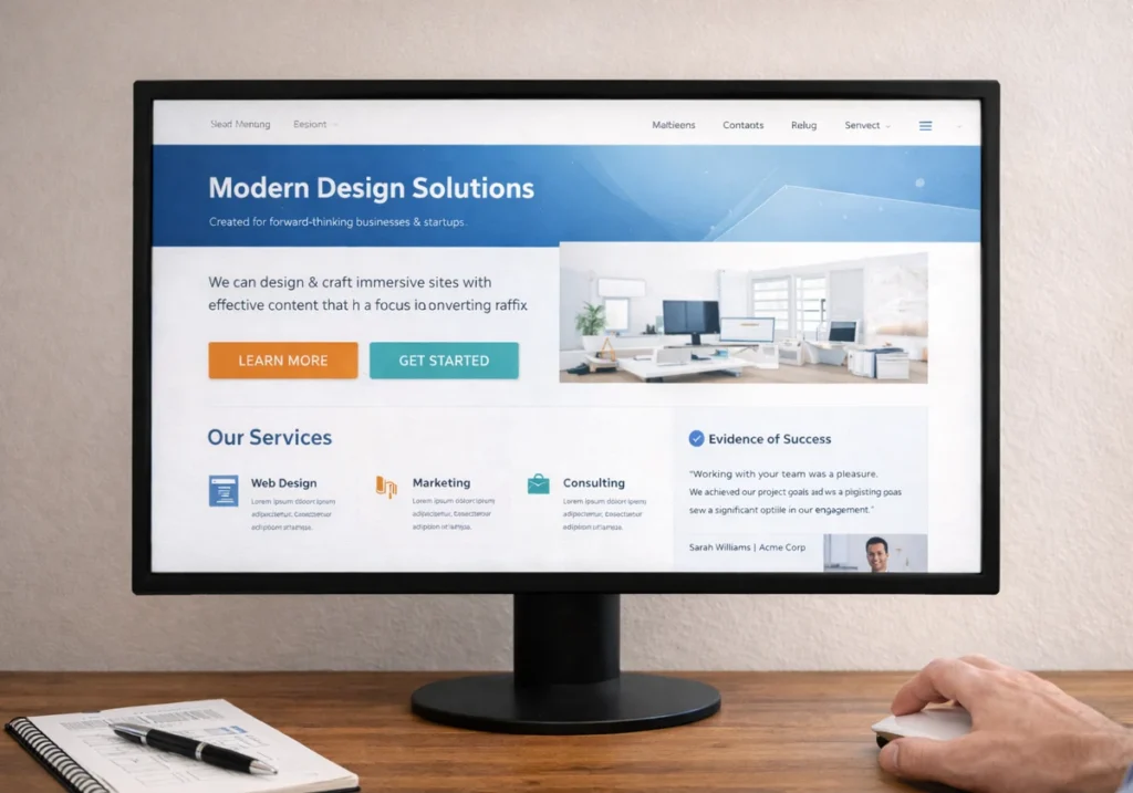
Cluttered Hero Sections That Confuse Users
Hero sections packed with multiple messages, rotating banners, and competing calls-to-action overwhelm users immediately. Because when everything screams for attention, nothing gets noticed. Rather, these cluttered features ignore basic user needs.
Conversely, modern hero sections in website design use single-focused messages with clear visuals and one primary action. The goal here is to achieve immediate clarity. It means the visitors should understand what you offer within three seconds of landing on your page.
However, most websites that convert well follow this principle well.
Motion Design and Micro Animations: What Modern Users Expect
The best part about motion design is that it makes your website feel alive without slowing down performance. Plus, small animations and micro animations guide users through your content in ways static pages can’t match.
Learn these web design trends and experimental approaches, and what people expect from digital experiences:
Anti-Design and Experimental Navigation Changed the Game
Anti-design breaks traditional layouts with asymmetrical elements, organic shapes, and unexpected arrangements. You’ll see this trend in websites that use sticker graphics, oversized headlines, and bold fonts positioned at unusual angles.
Besides, experimental navigation uses hidden menus, scroll-triggered animations, and unconventional patterns for memorable experiences.
This way, the year’s trends lean heavily into these creative approaches because they help brands be successful. But here’s the thing, these approaches only work when they enhance usability rather than confusing visitors trying to find information.
Big Blocks vs. Dynamic Content Presentation
Big blocks use large, bold sections with negative space, which makes scanning content easier on all devices. These layouts distinguish information clearly, so your page doesn’t feel cramped.
Meanwhile, dynamic content loads progressively as users scroll, using parallax scrolling to keep page speed fast and engagement high. The experience this creates feels modern and interactive.
On top of that, digital experiences built with these techniques reveal information at comfortable intervals instead of dumping everything on screen at once.
Bringing Your Site Up to Speed with Design Trends
Now that you know what outdated elements hurt your site, here’s how to fix them without a complete redesign.
- Mobile Responsiveness and Page Speed: Start with these two because they affect both user experience and search engine rankings. Then, test how your web pages load on actual phones, not just by resizing your desktop browser.
- Micro Animations on Interactive Elements: Add subtle movements to buttons, forms, and navigation features for a modern feel. Sometimes, small effects like hover changes and smooth transitions make your site feel more responsive without requiring a complete rush.
- Dark Mode Toggle and Clean Hero Sections: Our tests with client sites revealed that users appreciate having display options for comfortable browsing. Plus, hero sections work best when they highlight one primary action rather than overwhelming users with competing messages.
- Testing on Actual Mobile Devices: Don’t test mobile responsiveness in desktop. Because it misses issues that only appear when someone uses thumb-friendly mobile navigation on their phone. Instead, check how your features truly work with finger taps on your phone.
- Review Competitor Websites for Current Standards: Look at top web design trends in your industry to see what customers expect from sustainable web design. Also, notice how successful sites use variable fonts, vibrant colour palettes, soft shadows, and negative space to create brand personality and guide the user journey.
Bottom line: At the end of the day, small updates to your website design make a real difference rather than waiting for a perfect, complete redesign that never happens.
Time to Refresh Your Digital Presence
Your website design doesn’t need a complete rush to meet modern website standards. Small, strategic updates to outdated elements keep immediate effect on how users perceive your business and interact with your site.
That’s why focus on the design trends that affect user experience most, like mobile responsiveness, page speed, and clean hero sections. These changes improve both visitor satisfaction and search engine rankings without requiring massive investments.
Ready to bring your site up to modern website standards? GraphEdge specialises in creating websites people truly want to use. Start with mobile testing and work through the updates that make the highest impact.