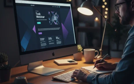
Visual design shapes first impressions more than content because people judge a website’s credibility and professionalism based on appearance. That judgement happens almost instantly, with visitors forming opinions in less than a second after landing on the page.
But the problem is, most business owners focus heavily on writing perfect content while overlooking how visual hierarchy and design elements guide user behaviour. It means you might have brilliant services to offer, but poor web design is pushing your potential customers away before they even read what you offer.
In this article, you’ll learn how design psychology creates first impressions and discover which visual elements truly influence users to take action. Plus, we’ll cover the psychological principles behind effective web design and show you what separates websites that convert from those that don’t.
Let’s dig in.
Visual Hierarchy: The Foundation of Effective Web Design
A clear visual hierarchy is the arrangement of design elements that controls the order in which visitors process information on your page. It’s how web designers guide your attention from the most important elements to supporting details without you even noticing.
However, there are two main ways visual hierarchy influences how users perceive your web page:
Design Elements That Guide User Behaviour
Size, placement, and spacing work together to tell visitors where to look first on your website. That’s why when you make a heading larger than body text, you’re using visual hierarchy to signal importance.
Besides, larger headings naturally grab attention before other elements on the page, which is why web designers always place key messages in prominent positions. With this approach, users can easily scan pages in predictable patterns.
Remember: White space around important elements makes the heading emphasised and prevents overwhelming your visitors with too much visual information at once.
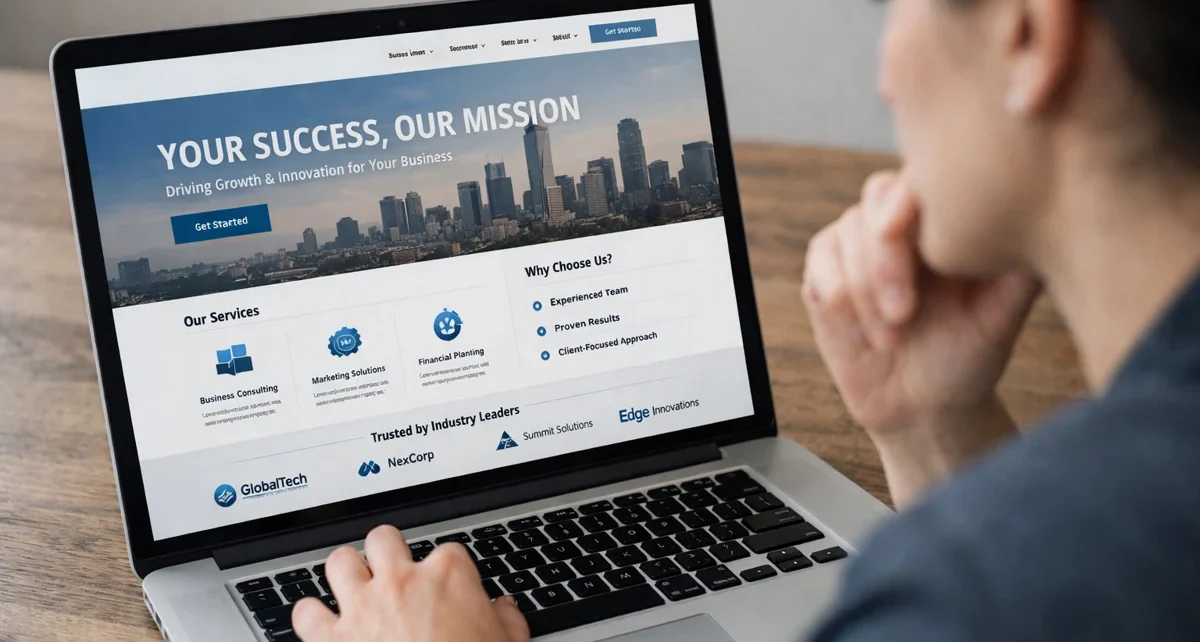
Colour Contrast Controls Where Eyes Land First
High contrast between text and background ensures readability by drawing eyes to key messages immediately. Plus, when your call-to-action button contrasts clearly with the surrounding design, users spot it faster.
For example, a bright orange button on a blue landing page naturally attracts attention compared to a grey button that blends into the background (and yes, we’ve seen plenty of unreadable grey-on-white disasters).
On the flip side, poor contrast causes visitors to miss calls to action even when they’re interested in your services. That’s why checking colour contrast should be part of every web design project before launch.
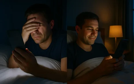
The Psychology Behind Split-Second Judgements
Ever wondered why some websites feel trustworthy instantly, while others make you click away? Well, it lies in web design psychology and how your brain processes visual information.
So, you need to understand the following design psychology to learn user behaviour well:
What Design Psychology Reveals About User Experience
Design psychology reveals how visual elements influence emotions, trust, anddecision-making on websites. When web designers understand these psychological principles, they can guide users toward desired actions naturally.
Meanwhile, people form opinions about websites within 50 milliseconds based purely on visual appearance and page layout. That’s faster than it takes to blink, which means your web design needs to serve credibility instantly.
According to MIT research, the human brain processes visual information within 13 milliseconds (typically faster than text), which makes web design your first communication tool with website visitors. Plus, familiar patterns and layouts reduce mental effort and help visitors to focus on your actual message instead.
Serial Position Effect and Website Navigation
Visitors remember the first and last items in lists best and forget the middle options more often. This psychological principle is called the serial position effect. And it affects important things like navigation menus, product listings, and so on.
That’s why navigation menus should place important elements at the start or end for better recall and clicks. For example, if you’re running an e-commerce landing page, position your best-selling products either first or last in category lists rather than burying them in the middle.
Product listings also perform better when your best options appear first or last in the sequence. Drawing from our experience with Brisbane clients, we’ve seen conversion rates improve by simply rearranging menu items to work with the serial position effect.
Drawing Attention Through Strategic Visual Design
The best part about strategic visual design is that it guides visitors toward actions without them realising they’re being led. That’s why you can easily create web pages that encourage users to click and convert.
And here things get interesting, because most web designers focus on making sites look good rather than using design elements that prompt action.
Let’s have a look at how wise design influences users’ perspectives and what they’ll do next:
Psychological Principles That Prompt Action
Directional cues like arrows orimages of people looking toward buttons guide the user’s attention naturally. It’s often related to Gestalt principles. Because when you place a photo of someone gazing at your call-to-action button, the viewer’s eyes follow that direction automatically.
Sometimes, scarcity indicators and urgency elements trigger faster decisions when designed with clear visual weight. For instance, a red banner showing “Only 3 spots left” draws attention more effectively due to the colour contrast and placement working together to attract users toward certain elements.
Consistency in button styles also trains visitors to recognise clickable elements across your website. That’s why, when your call-to-action buttons use the same colour scheme and size, users spot them instantly.
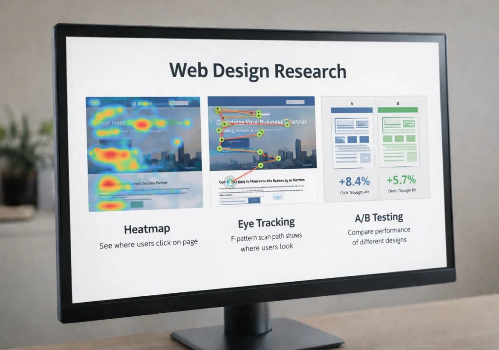
User Research Forms Design Decisions
Heatmap studies show where real visitors actually click versus where designers think they will click. This customer research reveals why users often ignore specific elements you assumed were obvious. It also proves why data-driven insights are more important than assumptions.
Furthermore, eye tracking helps position important elements in high attention zones. It’s because most users scan web pages in an F-pattern, where they look at the top and left-hand side first.
Beyond these, A/B testing for different page layouts proves which design elements really improve conversion rates.
Drawing from our experience with Brisbane clients, we’ve found that small changes to visual hierarchy can increase desired action rates by 30% or more when based on true user research.
Beyond Pretty Pictures, What Truly Works
Now that you understand the psychology, here’s what distinguishes decoration from functional design that truly converts.
- Functional Design Over Decoration: User-friendly websites prioritise helping users complete tasks over looking impressive. Plus, when web designers create websites with too many interactive elements or visual effects, they make the user experience worse.
- Loading Speed Beats Fancy Animations: Your web page needs to load in under three seconds, particularly on mobile devices where most Australian users browse (trust us, no one’s impressed by a slow-loading animation). Remember, a visually appealing landing page means nothing if people leave before seeing it.
- Mobile Responsive Layouts Are Essential: Based on our firsthand experience, over 60% of web traffic comes from mobile devices now. For this reason, user-friendly websites adapt their design elements automatically to fit different screen sizes. So your page layout must work perfectly on smaller screens without breaking.
- Accessible Design Choices Help Everyone: Readable fonts and proper heading structure make navigation easier for all visitors. White space also improves readability by giving users room to breathe between sections, while negative space around call-to-action buttons makes them easier to tap.
- Trust Signals Influence Decisions: Our tests revealed that real photos of your team and workspace create websites that feel more authentic than stock images. Besides, professional photography and consistent branding help users feel confident about your business through wise design choices.
Bottom line: A good page layout combines these design principles to simplify decision-making for visitors. Furthermore, effective web design uses this clarity to create a user experience that converts visitors into customers.

Start With What Visitors See First
Visual hierarchy and design psychology aren’t just nice extras for your web design. Instead, they’re what determines if users stay on your web page or click away within seconds.
When you understand how psychological principles influence user behaviour, you can create websites that guide visitors naturally toward the desired action. Plus, the best websites combine effective web design with clear visual elements that make decision-making easy for users.
If your current site isn’t converting visitors into customers, poor visual hierarchy might be the problem. Here, GraphEdge specialises in user-friendly website designs that combine wise design with proven web design psychology.
Get in touch to see how we can improve your user experience and move more visitors into customers.