
Below the fold or above the fold? We get that question a lot. And for years, our answer was always the same: “Users scroll now, so spread things out. No need to cram everything at the top.”
We followed our own advice. We kept pricing, testimonials, and key features below the fold to maintain a clean, minimal look. (Spoiler: bad idea)
After watching this strategy play out across client projects, the pattern became impossible to ignore. For most sites we worked with, moving important information above the fold consistently produced better results, especially for mobile users and search rankings.
Here’s what we observed about user behaviour, and how this UX SEO strategy can work for your site.
What Does “Below the Fold” Mean in Web Design?
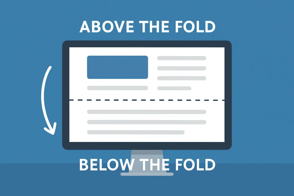
Below the fold is anything you need to scroll to see. It’s not visible when a page first loads.
Think about landing on a website. Everything you see right away is above the fold, and everything you need to scroll to reach is below it.
Here’s the catch: the fold isn’t fixed. It shifts based on device, screen size, and browser settings. A smartphone user’s fold appears much higher than a desktop user’s fold.
This placement becomes especially important when potential customers find your site through search results and need immediate answers. If your important information sits below their specific fold, they might never see it.
But where did this “fold” idea even come from?
It Started with Newspapers
The term “fold” comes from print. Newspapers were folded in half at newsstands, showing only the top half. Editors packed their biggest headlines above that fold to grab attention and sell copies. Web designers later borrowed the idea, which worked until mobile browsing changed everything.
Mobile-first Indexing Changed It
In 2018, Google switched to mobile-first indexing, which meant the search engine used the mobile version of websites for ranking instead of the desktop version.
The problem? The fold varies across different mobile devices and screen sizes. An iPhone has a different fold than a Samsung. Tablets sit somewhere in between.
And with responsive design, your content reflows depending on the screen. There’s no universal fold anymore. Search engine crawlers now evaluate how content appears on mobile phones when determining rankings, prioritising mobile-friendly sites in search results.
So knowing all this about the fold, why did we still get it so wrong?
The Logic Behind Hiding Content Below the Fold
For years, we recommended hiding key information below the fold. It made websites look cleaner and more professional. We followed every web design trend, from minimalist layouts and white space to bold hero images. Our visually appealing designs looked like they belonged in design awards galleries.
But then we started noticing a pattern. Sites with this approach kept struggling with conversions.
We didn’t connect the dots at first. The idea seemed sound. Keep the top of the page clean and simple, so visitors can find the details as they scroll. Don’t hit them with prices, testimonials, and product features straight away.
We also didn’t want to look desperate or salesy. Putting pricing and strong calls-to-action right at the top felt pushy. We thought a softer, less sales-focused approach would create a more user-friendly experience and build trust better.
Turns out, we had it backwards. While we were protecting “aesthetic,” potential customers were leaving because they couldn’t find what they needed. When users find a site that hides pricing and proof, they leave for competitors.
Once we spotted the pattern, we had to test a different approach.
The UX Changes We Made
Turning things around didn’t require a complete overhaul. We tested two categories of design changes across multiple sites.
1. Moving critical information above the fold
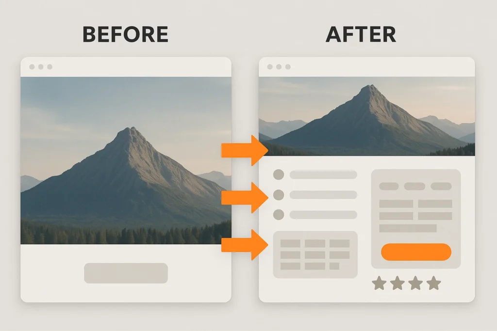
We moved the most important information above the fold:
- Product Benefits: Relocated from paragraph five to directly below the headline to make them impossible to miss.
- Pricing: Positioned above the fold so mobile users see costs without scrolling.
- Review Stars: Placed next to the CTA button to provide instant social proof.
- The Hero Section: Replaced the generic image with specific benefit statements that clearly explain our value.
These changes followed SEO best practices while maintaining our website structure and brand identity.
2. Adding visual cues so people actually scroll
Even with the most important info above the fold, some users weren’t scrolling. So we added simple cues to draw them further down the page and keep them curious.
- Downward Arrow: Added at screen bottom to signal more content below
- Partially Visible Image: Cut it off at the fold line to create curiosity about what comes next
- Smooth-scroll Text: Guided users to the demo section with prompts like “See how it works below.”
- Clear Continuation: Ensured content visibly continues past the initial screen to prevent visitors from thinking they reached the end.
What Happened After We Made the Changes
After implementing these changes across different sites, conversion rates improved, especially on mobile devices.
The reason was simple. Mobile users need information faster. They’re often on the go, comparing options quickly. When we gave them the right information above the fold and clear signals to keep exploring, they responded.
The page speed and Core Web Vitals improvements were an unexpected bonus. Largest Contentful Paint got better because key content is now loaded in the visible area first. The result? Users saw key information almost instantly, which improved engagement and made the site feel faster overall.
Cumulative Layout Shift has decreased since design elements stopped jumping around during page load.
These technical SEO improvements happened as a natural result of better user experience, which brought in more traffic from organic search results over time.
Why Above-the-Fold Content Works
The above-fold approach works when visitors arrive from a search with specific intent. But your website might need a different strategy entirely, depending on where your traffic comes from and what they already know about you.
For example, when someone searches “web design prices Brisbane” and lands on your site, they want to see pricing immediately. If you make them scroll through three paragraphs of company history first, they’ll likely hit the back button and try your competitor.
That’s why matching your fold content to search intent is so important. Smart web pages align their visible content with the keywords and intent their audience is using. High-intent visitors from search engines get instant answers.
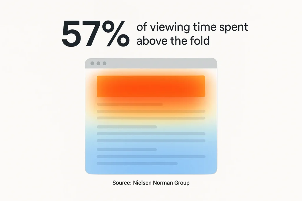
According to the Nielsen Norman Group’s research, users spend 57% of their viewing time above the fold, with content above getting significantly more attention than below. No wonder the pattern we observed was so consistent.
Still, not every website benefits from this approach. Some audiences need time and context before they’re ready to take action.
When You Should Keep Info Below the Fold Instead
Some businesses actually need the opposite strategy.
If you’re selling complex B2B software that costs $50,000 a year, a “Buy Now” button above the fold can scare people away. It asks for too much commitment, too fast. Long-form sales pages work better for high-ticket items. Build trust through detailed explanations and proof points before asking for the conversion.
The same applies to services requiring significant commitment. Putting your CTA right at the top feels aggressive. Visitors need to understand your methodology first.
Avoid the False Bottom
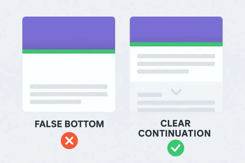
A false bottom happens when your design makes it look like the page ends, but there’s actually more content below. Horizontal lines spanning the full width. Complete-looking sections. Hero images fill the entire screen.
This is a mistake you must avoid at all costs. Because these signals “this is everything” to website visitors. Visitors stop scrolling, and you lose conversions because they never saw your pricing or testimonials.
The fix? Use partial visibility. Cut off an image at the fold so a headline peeks through, or add a subtle arrow to hint there’s more. Smart internal links can guide visitors naturally to related content below the fold. This way, it’ll be obvious that there’s more to explore.
How to Test Fold Placement on Your Site
You can test fold placement changes and improve website performance on your own site in less than a day using free tools.
Don’t just copy what we did and hope it works. Your content strategy needs testing so you know whether changes help users who arrive from search results.
Three Heatmap Tools that Show How Users Interact
- Hotjar: Watch session recordings and track how far people scroll before bouncing
- Microsoft Clarity: Free heatmaps (no credit card needed) that reveal ignored sections
- CrazyEgg: See the dead zones where visitors don’t click, scroll, or engage
All three offer session replay features. You can literally watch recordings of real users navigating your site. It’s like sitting behind them while they browse, except less creepy.
Track These Three Important UX Metrics
Once you make changes, focus on three numbers in Google Analytics:
- Scroll Depth Percentage: Measures how far visitors scroll down your page. If only 40% reach your pricing section, you need to adjust content placement.
- Conversion Rate: Tracks whether your design changes lead to actual results. Even a small 5% lift in conversions outweighs large increases in scroll depth.
- Bounce Rate: Indicates whether visitors stay engaged with your above-fold content or leave immediately. If it goes up after your changes, you moved the wrong information.
Combine these metrics with SEO best practices and you’ll have a complete picture of what’s working.
Getting Your Fold Strategy Right
The fold isn’t dead, but how you use it has changed. Mobile users scroll differently, and search engines prioritise user experience. Small adjustments can dramatically improve conversions.
We’ve covered why the fold evolved, why hiding information hurt our results, the exact changes we made, and how to test the right approach based on your traffic source.
Need help with your UX SEO strategy? Our Brisbane team can test fold placement on your site using real user data. Let’s talk about what might work for you.