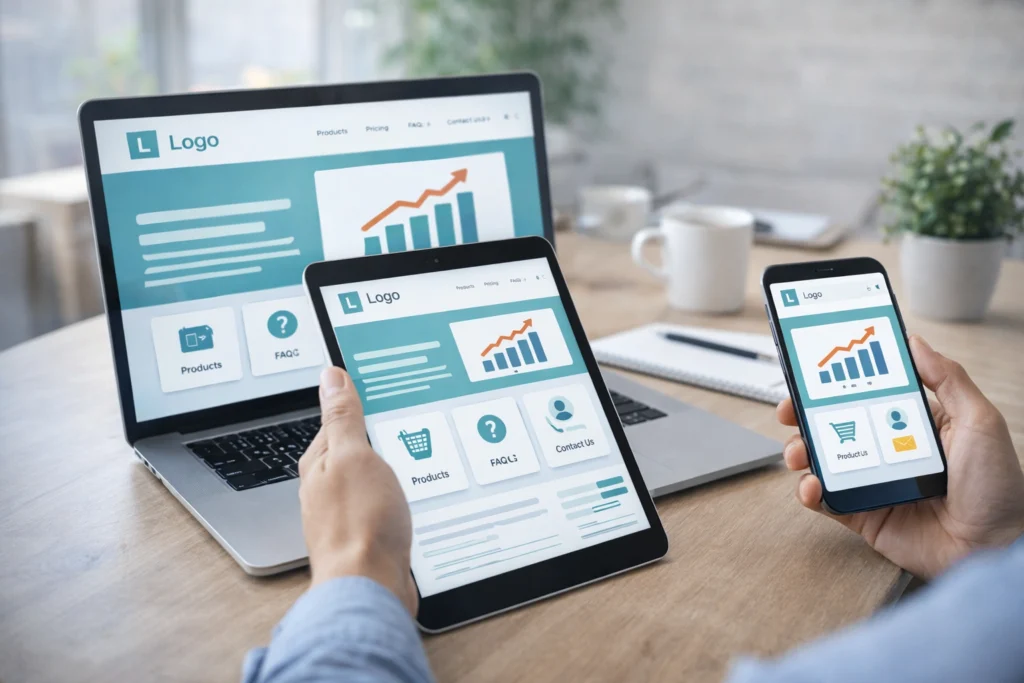
Good web design improves support and sales outcomes by making information easy to find, actions simple to complete, and user navigation clear. In fact, users form opinions about website visual appeal within 50 milliseconds, which means visitors judge your site solely on the design.
Conversely, when visitors land on a site with confusing navigation or hidden contact details, they don’t stay around to figure it out. And that means lost sales for your business.
In this article, we’ll show you how website usability reduces support tickets and sales friction. You’ll find out how usability testing catches problems before they cost you money, the way responsive design holds the attention of mobile users, and what brand consistency has to do with customer confidence.
Let’s understand all the connections between a good web design and sales.
What Is Website Usability?
Website usability measures how easily visitors can navigate your site, find what they need, and complete tasks without getting confused or needing to contact support. When your website works well, users don’t even notice the design because everything flows naturally.
Plus, well-organised information and clear navigation paths let visitors find answers on their own instead of emailing your team for help. It means users can complete their goals without hitting roadblocks or scratching their heads in frustration.
Does Intuitive Navigation Reduce Support Tickets?
Intuitive navigation reduces support tickets by helping users find answers on their own. A clear menu structure lets users self-serve instead of emailing or calling for basic information like pricing, contact details, or product specs.

From what we’ve seen working with local businesses, most support queries vanish once the menu structure makes sense to first-time visitors. When important pages sit exactly where people expect them, support teams spend way less time directing people around the site.
Users follow predictable patterns when searching for information. For instance, your contact page in the header, pricing in the main menu, and FAQs in the footer are where the target audience naturally looks for them.
In short, your user journey should feel obvious, not like a treasure hunt. If visitors can find what they need in two clicks or less, they stop bothering your team and start converting into customers instead.
Responsive Design Cuts Down Customer Confusion
Responsive design helps to stop users from pinching, zooming, and getting frustrated on mobile devices. When your site adapts automatically to smaller screens, people can actually use it instead of giving up within seconds.
Here’s how responsive design fixes those headaches without costing a fortune.
Mobile Apps and Desktop Sites Need Different Approaches
Mobile users expect tap-friendly buttons and condensed menus that work with thumbs, not mouse cursors. On the contrary, desktop layouts can show more information at once without unnecessarily overwhelming phone screens.
Meanwhile, a responsive design adapts automatically so users never struggle with tiny text or awkward horizontal scrolling (we’re all guilty of rage-closing those sites). The user interface adjusts based on screen size, and your site works whether someone is visiting from their phone, tablet, or computer.
Screen readers and assistive technologies also benefit from responsive layouts because the content flows in a logical order regardless of device.
Load Time Impacts Every Customer Interaction
Slow web pages frustrate 54% of visitors who abandon sites that take more than three seconds to load. Unfortunately, most businesses don’t realise this until they check their analytics and see massive bounce rates from mobile devices.
Fast load times keep user engagement high and reduce bounce rates throughout the entire user journey. When your site loads quickly, users stay longer, click more pages, and actually complete their purchases.
Bonus Tip: Optimised images, clean code, and proper caching improve speed without requiring massive technical overhauls. That way, the visual elements still look sharp, but they load in milliseconds instead of making people wonder if their internet connection died.
Usability Principles That Reduce Cognitive Load
Following website usability principles can eliminate guesswork for users who just want quick answers. When your site follows patterns people already understand, they spend less time figuring out how things work and more time doing what they came for.

Take a look at the practical changes that make your site easier to use right away:
- Simplify Information Display: Instead of bombarding visitors with every detail at once, break information into digestible chunks. When users see what they need for their current task, cognitive load drops, and they don’t get overwhelmed or click away.
- Stick with Familiar Layouts: Users already know instinctively where to look for elements like top navigation, footer links, and search bars. When user interactions follow expected patterns, people move through your site confidently without second-guessing every click.
- Cut Down Form Fields: Nobody wants to fill out 15 fields just to get a quote. The more information you ask for upfront, the more users abandon the process halfway through and never come back.
- Write Clear Error Messages: Vague warnings like “Error 404” leave users stranded with no idea what went wrong. On error pages, tell them what happened and how to fix it so they can get back on track instead of giving up entirely.
If you apply even two or three of these principles, you’ll notice fewer confused users contacting support about basic navigation issues. As a result, the site starts working for people instead of perplexing them at every turn.
Ecommerce Site Design With Usability Testing
Most e-commerce sites lose potential customers at the same predictable points, and fixing these issues should start during the design process. When you build usability testing into your workflow from the start, you catch problems before they go live and cost you money.
Here’s how your e-commerce design can improve sales.
Key Principles of Design Process to Improve Usability
The most important step for designing an e-commerce site is to map customer journeys. This allows you to identify where people drop off before completing their purchases successfully. So look at your analytics and pinpoint the pages where users abandon their carts or exit without buying.
Our design work shows the same bottlenecks coming up regardless of the industry. The usual culprits are:
- Confusing product pages
- Unclear shipping information
- Checkout forms that ask for too much information
Real user testing can show where people struggle. Which is why we suggest gathering user feedback from support teams who hear customer complaints about website problems firsthand. Because they know which questions come up repeatedly and can point you straight to the friction points.
This user research reveals what your target audience needs versus what you think they need. Sometimes the gap between those two things explains why your conversion rates stay stuck.
UX Optimisation Speeds Up Checkout
Shorter checkout processes with fewer form fields allow users to complete purchases faster without abandoning carts halfway through.
To give you an idea, guest checkout options remove friction for people who don’t want to create accounts right away. Unlike this approach, forcing registration before purchase is one of the fastest ways to lose a customer, especially for first-time visitors.
Clear progress indicators also show users how many steps remain until they finish buying. So when people know they’re two clicks away from completion, they follow it through.
These features may seem small, but user experience optimisation like this directly impacts your sales without requiring fancy features or expensive tools.
Fun Fact: Research from Forrester shows that every dollar invested in UX returns $100, which means fixing website usability problems isn’t just good for customers but pays for itself many times over.

Brand Consistency: Familiar Patterns Reduce Hesitation
Users trust websites that look and behave the same way across every page they visit. When your visual design, button styles, and tone stay consistent, people feel confident they’re still on your site and not on some sketchy redirect.
This is how you can keep brand consistency.
- Match Button Styles Everywhere: When your call-to-action buttons look identical on every page, people know which button to click. But if you mix up colours and shapes randomly, users slow down and start getting confused (especially after updates get rolled out in stages).
- Keep Colours and Fonts Uniform: Using the same colour schemes and fonts throughout the site builds trust and professional credibility quickly. Your visual language speaks volumes before users even read your content, so make sure it’s saying the same thing on every page.
- Create Predictable Page Layouts: When your homepage, product pages, and checkout follow similar structures, returning users find what they need without relearning your site. That’s why the website’s design should feel familiar to the users.
- Write in One Voice: Matching tone across all website content reduces confusion about who you are and what you offer. Say your homepage sounds casual, but your product descriptions read like a legal document. At that point, users begin to wonder if different companies built different sections.
These small touches of brand consistency add up to a user experience that shows reliability. If everything on your site reinforces the same message visually and verbally, users move through their journey with confidence instead of hesitation.
Build Your Website for a Positive User Experience
Good website usability allows confused visitors to become confident buyers by removing friction at every touchpoint. When users can navigate intuitively and pages load fast, support tickets drop while sales climb without needing to push more money into advertising.
The changes don’t need to be massive either. You only need to start by testing your current site with real users to identify where people get stuck. Also, focus on responsive design across mobile devices, clear navigation patterns, and checkout processes that guide users smoothly.
If you need help improving your website’s usability, the team at GraphEdge builds sites that reduce support friction and boost conversions through smart UX optimisation. We work with Brisbane businesses to create user experiences that convert visitors into paying customers rather than sending them to competitors.


